recent posts

social media menu

Showing posts with label hotels. Show all posts

The Pod: New York's most stylish budget hotel?

I wrote about a few of the photogenic places we ate, slept and shopped on holiday in the US earlier this year – in Mississippi, Nashville and New York. Today, a bit more New York, as I never shared the pictures our brilliant budget hotel.

The bar/restaurant downstairs. Meanwhile upstairs, on the 17th floor...

...the incredible rooftop bar. And here's the view from the seating area tucked behind the bar.

Doesn't look like the budget option, does it?

And if you've been to the Big Apple recently, you'll know that hotel rooms are astonishingly expensive – even the ones we found in various "affordable" round-ups were totally out of our league.

The original plan had been to Air BnB it, but there was nothing available. And now, of course, with the recent NYC law wranglings about these sorts of accommodations (they've been deemed "unlicensed hotels" and therefore potentially illegal, in case you missed this depressing development) cheap hotels are even more in demand.

Our hotel is one of two in a New York mini chain owned by hotelier duo, Richard Born and Ira Druckier of BD Hotels. It's called The Pod – we stayed at the newer premises, Pod 39 (so-called because it's on the corner of E39th Street – the other hotel is Pod 51, a few blocks up on E51st street). Aside from the astounding roof terrace cocktail bar pictured above, it also has a Mexican themed bar / restaurant on the ground floor, also shown in the opening image. And before we get onto the colourful decor, I should mention how excellent the cocktails were – particularly the unusual Salvation Michelada, which sounds weird but tastes amazing and blends Mexican beer with home-made chipotle hot sauce and lime, and the Sonora Old Fashioned – a mix of tequila and bacanora, a Mexican spirit that was once illegal, with chilli-honey and grapefruit bitters.

And the design, by Vanessa Guilford and New York restaurateur Ken Friedman, had just as much of a sunny theme.


Love the clash of patterns and the monochrome / colour combination.

This carved, illuminated wall, drawing on the traditional Mexican style, is filled with tiny religious and folk art figurines and objects in each cavity, backlit for drama.


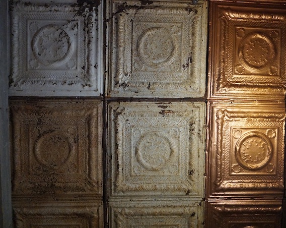
I do love a tiled table. In fact, I'm coming right back round to the idea of a tiled worktop, despite advice against it when I wrote about the topic last year.

The bar, below, was also brightly patterned.


 More monochrome / colour clashes in this shelf niche. Nice.

What a great colour palette: bright as well as cool and calming all at once.


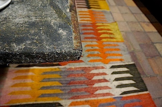
This beautiful woven rug pulls in all the colours throughout the bar. Along with incorporating some solid black elements or structured monochrome to anchor things, this is another good trick if you're going a bit colour crazy. You might need to find the rug – or fabric or painting – first though, and build the room around it unless you get very lucky. It's sort of what I tried to do when I painted my stairs seven different colours.


One of the walls in the bar / restaurant area.

And the long view.

Now for the rooms, and it's here that you'll see how the hotel has done the budget thing: they are tiny. But also extremely well designed to maximise space – for example there's room under the beds for luggage – so simple but such an under-used idea in the average hotel or B&B.

This was our room. A standard double, I believe. I think the Queen rooms have a smidgen more space and two bedside lights and tables.

I thought the bathroom design was really clever.

The shower and loo area were separated by the shower curtain, and you'd enter the room via the side with the basin and loo. (Great toiletries packaging too.)


The whole bathroom was behind glass, partially frosted for modesty, one half of which was also a sliding door. The wall-sized mirror facing back out into the room brilliantly bounced space back at you.

You can also get bunk rooms and single rooms.

For around $285 (£177) per room per night – £88 a night (per person) we thought it was pretty damn good for an immaculately clean, central New York hotel. I remember, a good few years ago, staying in an altogether different approach to budget in Times Square – we had to change rooms twice because of visible (and smell-able) remnants from previous guests.

See a bit more of the hotel and listen to Vanessa Guilford talking through the Pod's compact design.

Post by Kate

Mississippi style: rustic Americana

Well hello again. So I'm finally back from a pretty epic holiday in the States: a road trip from Nashville via Memphis, down to Clarksdale, Mississippi, birthplace of the blues – with a few deviations en route including a tranquil log cabin on the edge of a beautiful lake, a mental casino village that scared the life out of us and a long weekend in New York City. 

I'll be writing a full travel story about it on the other website I edit shortly. Meanwhile, here, some design highlights, starting with possibly my favourite stop-off – the excellently-named Shack Up Inn in Clarksdale.

The place is made up of a series of shacks, all different, that you rent out like hotel or motel rooms (above you can see the porch outside the one we rented, complete with rocking chairs). 

The shacks have all been bought by the owners and transported from nearby former plantations, and are the rooms once inhabited by plantation workers. In the wrong hands, it could be a somewhat ghoulish given the area's history, but the owners are big on history, huge on blues (which originated inside some of these very shacks, or some like them) and sensitive to what they're doing. They've also got a marvellous recycling ethos – though a few of the shacks are reconstructions, many are the very same buildings but with their corrugated iron and weathered wood patched together more solidly, and with electricity, plumbing (including great showers) and insulation subtly added in. Check out our room...

Isn't it brilliant? The bed headboard is made out of some kind of scrap metal. It looks great and I like the contrast with the soft, floral bedspread.

Loved this simple turquoise metal chair. Looks great against the bare wood boards and walls. 

A rocking arm chair in one corner of our room. The framed collage above it on the left shows the adverts for each individual shack. These are printed in the style of Hatch Prints, in Nashville, which I'll do a separate post about because it's so amazing.

The bathroom is beautifully plain but had one of the best showers of all the places we stayed. Love the burnished copper surround to the sink, and the contrast of that with textures of the wood walls and corrugated metal ceiling.

The view from inside our room. Pretty awesome, huh? And (very tiny in the distance) you can see my travelling buddy carrying one of the free-to-borrow guitars at reception.


Love the faded colours of the exterior of one of the other shacks.

And the pressed tin ceiling tiles from one of the other bathrooms (you can read more about these tiles in this previous post on the topic).

Each shack had a different coloured (eco) bulb lighting up its porch. Nice touch.

We stayed in this room on the first night. Love that quilted bedspread...

...And the little kitchen area...

 ...and the sweet bathroom.

This, above, is the shack from the outside.

To put it in context, above is a shot of the whole place from the other side of the deserted railroad track that runs in front of it. What about the Mississippi sky? It was immense – and dramatically different from the next state up, Tennessee. The further south we drove, the flatter the landscapes and the huger the skies. We were mesmerised.

And a close-up of those posters for the individual rooms. Below, the bar area, reception and general out-buildings at the Shack Up. I want to go back already.

I am a bit obsessed with American style ovens. This, above, is a really old one obviously, but even the modern ones are the same satisfyingly broad shape. Aren't those handles lovely? And as for the fridge – Smeg, eat your heart out.

The "TV area" at the Shack Up's bar.


Cowboy-friendly wall dedor upstairs at the bar. 


Some more of the shacks you can stay in. The automotive accessory (one of many rusting old trucks dotted about the place) should really look tacky and novelty. And if the place wasn't so quiet and untouristy, maybe they would have done. But we'd just come from brash, theme-parky Memphis central a few days earlier – and in this sleepy setting, they just added to the feeling that you'd stepped back in time.


We really struggled to tear ourselves away. But then we had the excitement of the open road for the next bit of the journey's inspiration... 

Soho House NYC: the revamp

Right. Who wants to live here? It's the Ilse Crawford re-spruced Soho House, New York style. 

OK, then. I quite want to live there.

I especially love the marvellously tiley bathrrom. Check out the full details over at the excellent Design Hunting blog, from New York Magazine's design editor, Wendy Goodman...