The spirit behind Creative Spaces (Cico Books), the final in a trio that also includes Creative Walls and Creative Display, isn't far off. It's about beautiful interiors, yes, but not necessarily fashionable ones.
Just clever, inspired and often slightly batty ones (I haven't featured, for example, the eye-boggling small conservatory furnished with matching leafy wallpaper and sofa fabric, clashing cushions, patterned carpet and satin wall sconces. It's brilliantly odd and oddly beautiful.) And each of the home owners works in some sort of creative profession – fashion, photography, art, architecture – and, proposes author, Geraldine James, who's also Selfridges homewares buyer, this is what ties these bold interiors together.
The reason for this particular selection of images from the book is that each has (at least) one very simple, but clever and inspired idea. And they're all pretty transferable.
Work with the things you can't get rid of
In the top image, I love that the bikes don't look out of place in the hall. Why? They're black. They simply boost the crisp monochrome finish started in the tiny blackboard, mirror trim, tile (and dog's nose). Bike storage is a pain in the ass – this simply turns the idea the other way around: match your wheels and your decor.
Old-up your bathroom with one key detail
Despite the striking modern tiling, this bathroom looks pretty old-school. And that loo has a lot to do with things. Yes, there are fantastic period details in the basin and bath, the vast, ornate mirror and towel hanger, even the beautiful scales – but the black loo seat, a surprisingly rare sight these days, is a stroke of genius. It changes everything.
Bannisters. It's all about the bannisters. Something that should look out of place can often be the very thing that defines a space as a creatively put together one.
Get a kitchen lamp
If you don't have a lamp on your worktop, let this picture entice you into it. This one is old and battered, as is the space around it. But the same magically cosy, interesting effect can be had with any style lamp in any style kitchen. Try it.
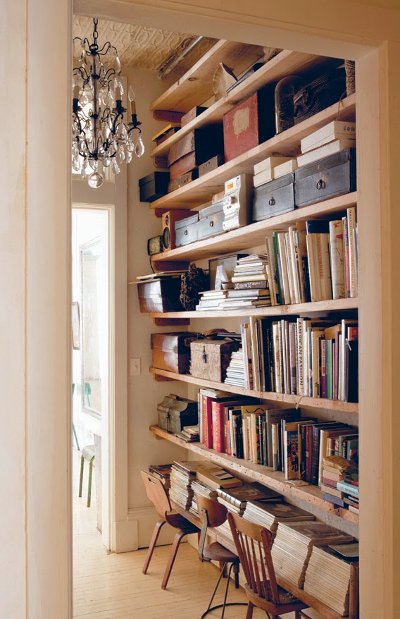
Put chairs somewhere odd
Chairs! For sitting on to leaf through those magazines that would otherwise be a little less pleasantly accessible. And they look great! And a bit out of place! And great for it!
Shelve your kitchen crap
Surely at least 90 per cent of us have toasters, kettles and cooking crap scattered (perhaps artfully) across our kitchen worktops. But doesn't it wind you up sometimes? It's precious space, it'd be so much more useful empty – worktops for working on. The answer? A TOASTER/KETTLE/COOKING CRAP SHELF. Ingenious yet obvious. Keeps things tidy, but swerves kitchen sterility by not hiding them away entirely. Love it. Simple but oh so satisfying.
Creative Spaces by Geraldine James is published by CICO Books at £19.99 and is available from Cicobooks.com
Post by Kate


No comments :
Post a Comment