recent posts

social media menu

Showing posts with label ideas and inspiration. Show all posts

How to be tidy (and some
storage porn)

I'm still on a high from the massive garage clear-out; a few scary cupboards inside got a healthy de-clutter. 

But, while it's all good for the weeks following a big blitz like this, if you’re anything like me (untidy at heart) you’ll soon be wading through mood-dampening mess in no time. I’m in awe of tidy people: what are their secrets? 

Above: Future & Found's bright and cheerful stacking crates, which start at £6

“Clutter is only clutter if it doesn't have a home,” says my tidiest friend, Lizzie. “I have a draw of ‘useful things’ – wrapping paper, scissors, ribbons, cards, so rather than shoving them in random piles, they have a place.” She also sorts paperwork weekly “so it’s never daunting”.

But where d’you get that sort of self-discipline? “Fear,” says another tidy friend, Paul plainly. “I visualise how overwhelmed I’ll feel if things get out of control.” 

Above: Ottoman from Made A New's Etsy shop, £150. But if you are handy you could rustle one up yourself with not much more than a lucky find, a fabric scrap and a staplegun.

Since that chat, I’ve vowed never to see my bedroom clothes mountain again by focusing on how unpleasant the bedroom feels with it, the time it takes to clear, and how Zen I feel without it. Getting into the habit of actively channelling those emotions whenever poised to hurl things on the bedroom chair heap has proved more effective than I'd have imagined. But if it doesn't last, I'm tempted by the idea of a bedroom ottoman instead, like the one above. Clothes heap: hidden.

Lizzie has another tip: “Have spare hangers in wardrobe. It’s only grim hanging clothes in an over-packed wardrobe: stick out-of-season clothes in cases.” I often think about doing that. One day I might be tidy enough to manage it, and when I do I'll be stuffing them into one of the oversized, rectangular storage bags from Dotcomgiftshop.com, above, just £4.95. I have already, and a little smugly I'll admit, bought the from-the-market launderette version of these and packed away spare duvets and pillows.

Above: small Ferm Living fabric storage basket, £49, Made in Design

Consider, too, your barriers to tidying. My aversion to sorting months of un-dealt-with domestic paperwork was partly down to not having a plan for the stuff I'd sorted out. Lizzie swears by archiving (a plastic bag in the attic will do); then stop talking about buying that shredder and finally get rid of the stuff you really don't need to keep. 

Tidy types love a “system”. But it can be forced. When I colour-coordinated all my books there was an unexpected side-effect (along with mild self-hatred for being such an interiors cliche): it looks so untouchable that it’s now immune to excessive random shelf-tat. Matching shelf colour to walls adds to the veneer of neatness.

Above: curtain fabric by Sanderson's Maycott Collection

Don’t fancy my uptight shelves? Hang beautiful fabric on curtain wire to hide all the crap. Use the same technique, plus a clothes rail, in an empty alcove to hide chunky coats, hallway junk, excess shoes, toys… 

Cork tile pinboards (so you can shape your own) are a top cheat if you’re prone to hoarding scraps of paper. But to avoid a student kitchen vibe, I love this idea my brother – a picture framer – suggested, and which I'm going to try myself soon: get the corkboard framed with a box frame and paint it the same colour (or choose wood the colour of your cork). It'll create a pleasing sense of containment.

And if all that fails, consider Monica’s chaos cupboard in Friends: “Tidy people aren’t really organised and smug,” says Paul, “it’s a veneer. Just because you can’t see the mess it doesn’t mean it’s not there. I’m tidy – but you probably know where to find things.” 

This is an edited version of my column on the topic in the Independent on Sunday a while back.

Another retro trend renaissance: hello pink bathrooms

Pink bathrooms are a trend a-brewing, I'm telling you, and I've been eyeing them longingly for a while. 

I thought it might just be me, but then these much maligned blasts from the past started popping up all over Pinterest. (Though not especially looking like this one, below, even though it's incredible.)

Then I visited the beautifully designed Bill Granger restaurant in Clerkenwell (read about it here) and was delighted to be greeted by a wall of muted bubble gum pink wall tiles (but alas no gold taps, though there was some gold trim). See it below.


And THEN I stumbled across an even bigger sign that love for pink bathrooms was big right now. There is a website campaign devoted to the revival of these divisive mid-century set-pieces. But before we get to that, let's have a look at some good ones.

Images: Retro Renovation (more of which below)


Above: images above from a rather slinky home in Melbourne, via Dustjacket-attic 

Above: this is the bathroom in Jo Woods' home. Love the matching giant 80s perfume bottles. See the rest of it here on the Daily Mail website


So the campaign, a brilliant, brilliant idea, is run by Retro Renovation. I'm incredibly late to it (it launched several years ago but since I obsess over interiors websites more than most, you may also not have come across it). The idea, as you might guess by the name of the website, is to preserve the classic 1950s/60s originals, to inspire new owners not to rip out the original bathroom suite simply because it's not white.

And Retro Renovation weren't messing about. Fuelled by wilful destruction on interiors DIY shows on TV, they launched a proper campaign, complete with Flickr group and pastel bathroom messiah merch (above). Yes.

If you love the originals, check out this incredibly well preserved 1962 house I wrote about a couple of years ago. You'll love it. And if you're hankering after a blush bath, look no further than HM James, who own the patents to some of the original avocado, rose and lemon suites and now reproduce them. I'm all for it, just trying to work out how I could incorporate some pink into the freshly painted all white bathroom...

But what do you think – could you perform your ablutions comfortably with a candyfloss backdrop, or is white the only way to go in the 21st century?


Wednesday Question: gold taps – well, would you?

Gold taps were to 80s interiors what a Lamborghini is to inner city driving. A bit showy-offy for the sake of it.

So who'd have thought they'd be reincarnated all these years later in such pleasing way? It's a quick post from me this week as there's lots going on, but here's a run down of the new way to do gold taps. The trick is to mix them with a utiltarian back-drop and play down the flash.

Via 22-quick.com


Weathered bronze taps by Barber Wilsons

Image: interiordec.com

Utilitarian... or, the big budget option: solid marble. Image: petrabindel.com

But, like coloured kitchen appliances, is it such a now trend that in five years you'd be yearning for plain old chrome again?

Freestyle Thursday:
colour me good

Colour inspiration can come from all sorts of places. 

I've found it before on philosophical book covers, on the Berlin U-Bahn (scroll about half way down), on necklaces and always inspired by the vibrant combinations the excellent Out of the Dark team come up with.

And today, I'm feeling inspired by the Autumn lookbook from Sofa Workshop. They've taken some very beautiful shots of their new range – and given the pictures extra wallop with some creative colour contrasts. Here are my favourites.

Above, if strong shades scare you – putting a rich colour against the right neutral background keeps things muted yet striking. This denim blue and biscuit-y wall get along famously don't you think? The backdrop really brings out the brightness of the sofa. And that yellow book suggests a good cushion or accessory colour if you're after a zingier palette still.

...like this. Not for the faint-hearted. But how good does that yolky wood look against the purple-y blue of the sofa. I like the heavy-handed blue accent in the footstool and cushion too – way to beef up a colour's presence, without drowning a space in it, or creating the interiors equivalent of a double denim outfit.

And bolder still...


But if that's too much for you, this takes it down one small notch.

Kinda high summer cobalt skies and lemon sorbet – combinations that come together happily in real life are also a good place to plunder for colour scheme ideas.

I do love the dark and the zing effect though – and these strong colours feel more manageable and less in-your-face with that confident, grown-up neutral backdrop.

But if understated is way more your thing, give natural tones a sharp edge with strong accents: black does a very good job, and I like the green grasses here too, giving taupes, ropes and beiges a sand-dune vibe.

See more at the Sofa Workshop website

Post by Kate (still in the thick of plaster dust)


Wooden panelling: another Retrouvius refit

An interior made from salvaged materials – especially lots of beautiful wood – was one of the most popular posts here in recent months. 
The team behind the design of the place were Retrouvius, whose work and architectural salvage and furniture shop I really love. They've just completed another interior design project, this one still all about reclaimed and reused materials, but far slicker in style. What do you think?
This five-storey house is in swishy Primrose Hill, north London, and Retrouvius say that the place was in such a state when work began that "at one point on opening the front door one could see all the way up to the sky and across all four floors to the basement."

All images: www.retrouvius.com 
Although this is obviously a very high-end property, the use of reclaimed materials is something any project can employ. If it's something you are doing or thinking of doing, you might be interested to read about the fashion designers Antoni & Alison, who painstakingly did up their own old house/studio by reusing materials, and share their insider tips for finding treasures and key materials over in this post.

Love the detail above right, where tiling extends into the painted floor-boards. And what beautiful, calming, summery colours. The floor is wire-brushed wood oak strip, "very light-allowing" explain Retrouvius.

The kitchen really highlights the beautiful contrast between sleek, clean-lined design and the use of battered old materials. I think it really softens a space that, with all new materials, could have been clinical and lacking in character.

This incredible parquet flooring and panelling is panga panga . Look at how they have had the strips arranged – though parquet is a traditional, classic style, the unconventional patterns here give it an interesting quirk. 


"All three bedroom floors wanted a relaxed summer bare-foot feel with painted pine boards," explain Retrouvius. "And from the initial client meeting the design team aspired to completely re-orientate the spatial flow of the home - maximising its relationship to the rear and the incredible mature wooded view." (Which you can see out of the window, above.)

You can compare it with the other – very different – Retrouvius project in this previous post. Find out about commissioning Retrouvius for a design project, or nose around their gorgeous online shop at www.retrouvius.com

Abi's zingy kitchen makeover

Today's post comes to you from Abi.

I love cooking. I love having friends over to eat nice food, drink a few Babychams and natter for hours in a cosy kitchen. Alas, our kitchen was making me a bit sad. Here's how it looked...


It wasn't really the kitchen's fault – it was the first room we did up when we moved in to our little Deptford haven nine years ago; cheap and cheerful and making do with what we could afford (not much) and what was already there (lovely quarry tiles, a tiny utility room).

We created a kitchen that served us well but I started getting the bug to re-do it, mainly after seeing the rather fabulous job Kate had done on hers. [Thanks Abi! I posted some photos here a while back if you want to see it]. I wanted a bit more character, a little more storage and a lot more work surface; I wanted to create a room that nodded towards my mid-century tastes but didn't want it to end up looking like a retro home. So off I went with a (slightly) larger budget than nine years ago and barrel load of ideas. And now it looks like this...


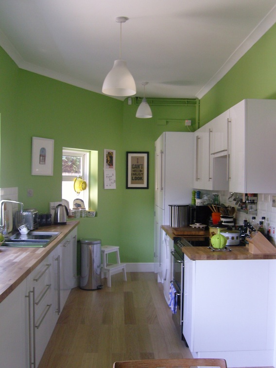
The first thing was a major decision: to remove the wall that separated the kitchen and utility room – we decided to do this to free up space and create a galley kitchen; giving us more light and space so it would feel more like a kitchen/dining room. This was the worst bit of the project – clearing out the entire kitchen, everything covered in dust and rubble (my idea of hell, DUST), and masses of hammering; not good when you work at home. Still, our fab builder did it in a few days and then the real fun started...


The red quarry tile floor (above) went first; as lovely as the tiles are they just didn't fit with the mid-century mood I wanted and as it would have cost a fortune and taken days to remove them we found an engineered limed oak wood flooring  we laid right on top.

A new radiator went in; when I say new I mean old-new; these gorgeous reproduction cast iron radiators are gradually being fitted in all our rooms; they're not cheap but they pack out a lot more heat than conventional radiators and retain their heat a lot longer once your heating is off so they actually save money in the long run.

I always liked the high gloss white units we had so to save money we just hunted around and bought a few extra units and doors to add to the existing ones. I used DIY Homefit for the doors – they also make custom size doors at very reasonable prices. We also reused a left over door to add to the plinths. All the appliances went into integrated units to keep the sleek look of the kitchen; except the tumble-dryer – it's extraordinarily expensive to find an integrated one so we just tucked the new one under the worktop. I also caved, after many years of resistance, to a dishwasher. I am now a bit evangelical about it; they're lovely things. I love mine very much.

We upgraded the (now much longer) worktops to solid oak; you need to sand them down and then apply about six coats of wood oil to seal them. Remember to reapply the wood oil once a year to help keep the wood looking delightful. I loved the mix of woods taking shape; especially knowing the teak table and chairs just waiting to be moved in (more on them later).


We replaced the brown tiles on the walls with small white brick bevelled tiles, above; Tons of Tiles supply exactly the same tiles as other fancypants high street stores but at half the price. I love these little tiles; retro but super high gloss to go with the cupboards.

Already the kitchen was lighter, brighter and felt more spacious. We put the old storage cupboards back up on the back wall, just a little lower down so I could display all my 70s coffee pots on them (and reach them – my, considerably taller, husband had originally hung the cupboards to his height, effectively rendering them out of bounds for titch me).

Finally, the paint decision. Never have I deliberated more. I didn't want white or beige or anything neutral but equally I didn't want too heavy a colour to darken the kitchen again. In the end I went for an apple green; it's bright and crisp during the daylight but at night in artificial light it goes a zingy lime. I got the paint from Crown at B&Q after looking at many many expensive others – it's called Olive Press but don't be fooled, it's definitely apple green. Maybe it's a confused olive, either way I think it makes my kitchen look yummy.

And then, after three long weeks of dust, dirt, grime and washing up in the bath I got to do the thing I'd been waiting for: putting everything back and hanging pictures and scattering 60s and 70s pottery everywhere – heaven. I'd been buying up cheap bits and pieces from Ebay, scouring car boots (there's a particularly brilliant one, Fontwell Park Car Boot, near my mother-in-law's and charity shops and have found a few gems, like these...


My mum is also good at finding things – saucepans in particular (although the brown one, above, is from her, a nice reminder of days spent sitting on the kitchen worktops 'helping' her cook when I was a little girl).

We put up lots of pictures and prints and the giant M (above, husband's birthday present) will go on the wall when we've found an A to go with it (I got the pink ampersand from eBay). And don't be shy of places you might normally not visit – I found some Orla K style storage jars for a fiver each from Matalan, the candle sticks, pictured above, are from my new favourite place Tiger, as were the picture frames (a quid each!); the postcards are all from the big box of Penguin book covers; a steal at £9.99 for 100 book covers – the display possibilities are endless but I dug out the green ones to go in the kitchen, and added some Argos retro tin caddies.

The table was the best bargain – totally free from a trader at the aforementioned car boot; he was packing up for the day and just didn't want to take it back with him – we couldn't believe our luck – a teak 1969 Macintosh table; it's always worth hanging about the big traders at the end of the day I've discovered; they'd often rather give stuff away than cart it back with them. The danish teak chairs we had in storage and fit perfectly with my mid-century vision, although I think I'll recover the seats with a green fabric at a later date.

So, the kitchen's all done and on a fraction of what you could've spend if you'd got a big store to do it. It might take longer, the dust and grime and upheaval are nearly unbearable and I never want to see another microwave meal in my life but now I have my dream kitchen; full of personal touches that make me smile when I'm cooking and, if I'm completely honest, I think my cakes taste a teeny bit better too.