Anyone else mildly obsessed with Apartment Therapy's 'The Kitchn' strand – I get a daily recipe email that always seems to be easy and quick, but delicious and inventive and makes me look impressive. So I really love it when they do kitchen tours, because the focus is usually driven by love of food rather than love of impractical expensive gadgets and sleekly fitted this and thats.
Check it out – or at least, if you also love this featured kitchen below, which is all about how loads of us live in rented homes, and that swanky matchy-matchy new cooking spaces are overrated.
Those pans on the wall remind me that my favourite part of the Damien Hirst show at the Tate last year was his row of brightly painted saucepans nailed to a white gallery wall. You can't beat pans on a wall.
I also really like the window bunting, below. Pretty but not twee – and works a miracle on an otherwise ugly, curtain-less expanse.
Looking at this gloriously imperfect space makes me love my own equivalent a little more. I am lucky that I own my place and have had the kitchen reconfigured. But it was on a real budget and the bits that didn't get finished or didn't quite work have never been fixed.
So the shelves don't match the shelves I'd meant them to match (which was my own fault because I was too impatient to wait a couple of days); the lighting is a bit wonky (there's a broken lamp that needs to lean on a flask on top of the fridge to cast a glow, and the supposedly dimmable spotlights buzz so much that you can't really use them); the idea I had for lovely hint of the 1950s worktops, by using original lemon flecked Formica was a DIY job too far for my builder who, bless him, did his best to glue the stuff onto the Wickes cheapy I'd bought but ended up giving it wiggly edges.
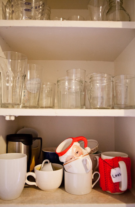
And I am always thinking I should tidy up my open storage and co-ordinate my cups... but why?
It's all a bit Rachel Khoo, but without being annoying (envious? Pah. Oh, well, yes, maybe a bit... but I bet I'm not alone, right?).
I have these Ikea pots, but mine hang – as sold to do – from one of their hanging rails on S-hooks. The design doesn't quite work though, so they tilt and everything is always falling out. I am inspired by Leela's simple adaptation. Must experiment with some different wall fixings.
God these American cookers are good, aren't they?
My craving for neat windowsills is nicely dampened looking at this little display. Everything has its place, but sometimes that place is on display when, say, it's a jam jar full of pens you need to use for shopping lists and kitchen crosswords all the time. Yes, you could hide them, but perhaps that would be contrived.
Go to The Kitchn to see more images and the full interview with the owner of this space.


Normals kitchens can be given that luxurious look only by small changes. Believe me, it is not that difficult.
ReplyDelete