recent posts

social media menu

Showing posts with label kitchen. Show all posts

Shipping forecast fondness

The British fondness for Radio 4's Shipping Forecast is a comforting thing.

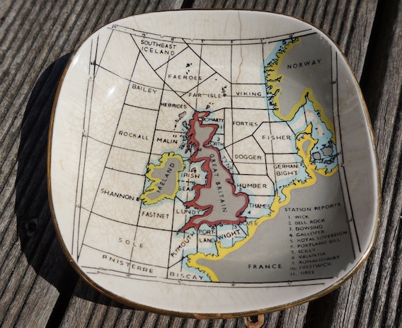
And thanks to E. Annie Proulx, even American readers (and I know there are a lot of you) will know what I'm on about. It's why this tiny little pin dish – depicting the evocatively named sea regions surrounding the British Isles – is pretty much my favourite thing in daily use in my house.

It's a bit knackered, and it only cost about £1, but I have used it every day since I found it – gleefully – in a magnificently bulging Isabel Hospice Shop (I think) in Potter's Bar, where I'd been to interview someone for a story.

I use it to put used tea-bags on (shamefully, as you can see, despite my scrubbing it quite hard for the photo its use is quite clear). I almost thought it was too good to use for my teabags – precisely because it was likely to get stained, and also because I liked it too much to want to give it such a prosaic purpose. But then I'd have been denying myself the daily pleasure I get from looking at it.

I hadn't looked at the back for the manufacturer until today (I bought it a little while back – prompted to write about it now for a reason I'll get to shortly): Britannia Dartmouth, it says. I Googled them and found that eBay is very well stocked with partner pieces.

There's the exact same dish currently going for £3.99 (and stain-free!), as well as the variation you can see above, for £1.99. The eBay search also threw up a few other Britannia designs of this ilk – one depicting London, one of the county of Devon, and a rather odd one with an illustrated Teddy Boy on it... Anyways – if you like the style, have a browse.

Now for the afore-mentioned prompt. I stumbled across this, below, which also feeds the warm fuzzy feeling we have for the Shipping Forecast.


It's a screenprint from the Calm Gallery and is by the prolific illustrator, James Brown. It's titled Viking, after the first region on the map, and costs £35 unframed.

Abi's zingy kitchen makeover

Today's post comes to you from Abi.

I love cooking. I love having friends over to eat nice food, drink a few Babychams and natter for hours in a cosy kitchen. Alas, our kitchen was making me a bit sad. Here's how it looked...


It wasn't really the kitchen's fault – it was the first room we did up when we moved in to our little Deptford haven nine years ago; cheap and cheerful and making do with what we could afford (not much) and what was already there (lovely quarry tiles, a tiny utility room).

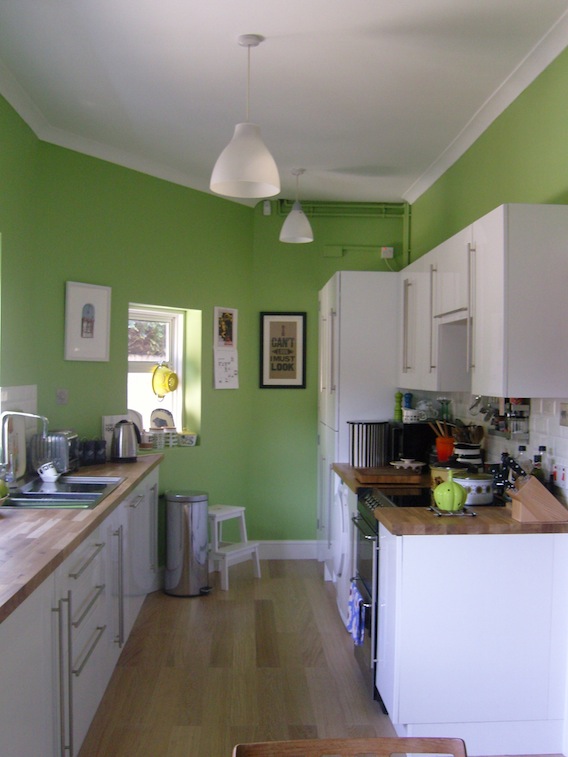
We created a kitchen that served us well but I started getting the bug to re-do it, mainly after seeing the rather fabulous job Kate had done on hers. [Thanks Abi! I posted some photos here a while back if you want to see it]. I wanted a bit more character, a little more storage and a lot more work surface; I wanted to create a room that nodded towards my mid-century tastes but didn't want it to end up looking like a retro home. So off I went with a (slightly) larger budget than nine years ago and barrel load of ideas. And now it looks like this...


The first thing was a major decision: to remove the wall that separated the kitchen and utility room – we decided to do this to free up space and create a galley kitchen; giving us more light and space so it would feel more like a kitchen/dining room. This was the worst bit of the project – clearing out the entire kitchen, everything covered in dust and rubble (my idea of hell, DUST), and masses of hammering; not good when you work at home. Still, our fab builder did it in a few days and then the real fun started...


The red quarry tile floor (above) went first; as lovely as the tiles are they just didn't fit with the mid-century mood I wanted and as it would have cost a fortune and taken days to remove them we found an engineered limed oak wood flooring  we laid right on top.

A new radiator went in; when I say new I mean old-new; these gorgeous reproduction cast iron radiators are gradually being fitted in all our rooms; they're not cheap but they pack out a lot more heat than conventional radiators and retain their heat a lot longer once your heating is off so they actually save money in the long run.

I always liked the high gloss white units we had so to save money we just hunted around and bought a few extra units and doors to add to the existing ones. I used DIY Homefit for the doors – they also make custom size doors at very reasonable prices. We also reused a left over door to add to the plinths. All the appliances went into integrated units to keep the sleek look of the kitchen; except the tumble-dryer – it's extraordinarily expensive to find an integrated one so we just tucked the new one under the worktop. I also caved, after many years of resistance, to a dishwasher. I am now a bit evangelical about it; they're lovely things. I love mine very much.

We upgraded the (now much longer) worktops to solid oak; you need to sand them down and then apply about six coats of wood oil to seal them. Remember to reapply the wood oil once a year to help keep the wood looking delightful. I loved the mix of woods taking shape; especially knowing the teak table and chairs just waiting to be moved in (more on them later).


We replaced the brown tiles on the walls with small white brick bevelled tiles, above; Tons of Tiles supply exactly the same tiles as other fancypants high street stores but at half the price. I love these little tiles; retro but super high gloss to go with the cupboards.

Already the kitchen was lighter, brighter and felt more spacious. We put the old storage cupboards back up on the back wall, just a little lower down so I could display all my 70s coffee pots on them (and reach them – my, considerably taller, husband had originally hung the cupboards to his height, effectively rendering them out of bounds for titch me).

Finally, the paint decision. Never have I deliberated more. I didn't want white or beige or anything neutral but equally I didn't want too heavy a colour to darken the kitchen again. In the end I went for an apple green; it's bright and crisp during the daylight but at night in artificial light it goes a zingy lime. I got the paint from Crown at B&Q after looking at many many expensive others – it's called Olive Press but don't be fooled, it's definitely apple green. Maybe it's a confused olive, either way I think it makes my kitchen look yummy.

And then, after three long weeks of dust, dirt, grime and washing up in the bath I got to do the thing I'd been waiting for: putting everything back and hanging pictures and scattering 60s and 70s pottery everywhere – heaven. I'd been buying up cheap bits and pieces from Ebay, scouring car boots (there's a particularly brilliant one, Fontwell Park Car Boot, near my mother-in-law's and charity shops and have found a few gems, like these...


My mum is also good at finding things – saucepans in particular (although the brown one, above, is from her, a nice reminder of days spent sitting on the kitchen worktops 'helping' her cook when I was a little girl).

We put up lots of pictures and prints and the giant M (above, husband's birthday present) will go on the wall when we've found an A to go with it (I got the pink ampersand from eBay). And don't be shy of places you might normally not visit – I found some Orla K style storage jars for a fiver each from Matalan, the candle sticks, pictured above, are from my new favourite place Tiger, as were the picture frames (a quid each!); the postcards are all from the big box of Penguin book covers; a steal at £9.99 for 100 book covers – the display possibilities are endless but I dug out the green ones to go in the kitchen, and added some Argos retro tin caddies.

The table was the best bargain – totally free from a trader at the aforementioned car boot; he was packing up for the day and just didn't want to take it back with him – we couldn't believe our luck – a teak 1969 Macintosh table; it's always worth hanging about the big traders at the end of the day I've discovered; they'd often rather give stuff away than cart it back with them. The danish teak chairs we had in storage and fit perfectly with my mid-century vision, although I think I'll recover the seats with a green fabric at a later date.

So, the kitchen's all done and on a fraction of what you could've spend if you'd got a big store to do it. It might take longer, the dust and grime and upheaval are nearly unbearable and I never want to see another microwave meal in my life but now I have my dream kitchen; full of personal touches that make me smile when I'm cooking and, if I'm completely honest, I think my cakes taste a teeny bit better too.
Normal kitchens

Anyone else mildly obsessed with Apartment Therapy's 'The Kitchn' strand – I get a daily recipe email that always seems to be easy and quick, but delicious and inventive and makes me look impressive. So I really love it when they do kitchen tours, because the focus is usually driven by love of food rather than love of impractical expensive gadgets and sleekly fitted this and thats. 

Check it out – or at least, if you also love this featured kitchen below, which is all about how loads of us live in rented homes, and that swanky matchy-matchy new cooking spaces are overrated.

Those pans on the wall remind me that my favourite part of the Damien Hirst show at the Tate last year was his row of brightly painted saucepans nailed to a white gallery wall. You can't beat pans on a wall.

I also really like the window bunting, below. Pretty but not twee – and works a miracle on an otherwise ugly, curtain-less expanse.

Looking at this gloriously imperfect space makes me love my own equivalent a little more. I am lucky that I own my place and have had the kitchen reconfigured. But it was on a real budget and the bits that didn't get finished or didn't quite work have never been fixed.

So the shelves don't match the shelves I'd meant them to match (which was my own fault because I was too impatient to wait a couple of days); the lighting is a bit wonky (there's a broken lamp that needs to lean on a flask on top of the fridge to cast a glow, and the supposedly dimmable spotlights buzz so much that you can't really use them); the idea I had for lovely hint of the 1950s worktops, by using original lemon flecked Formica was a DIY job too far for my builder who, bless him, did his best to glue the stuff onto the Wickes cheapy I'd bought but ended up giving it wiggly edges.

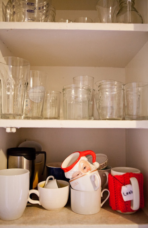
And I am always thinking I should tidy up my open storage and co-ordinate my cups... but why?

It's all a bit Rachel Khoo, but without being annoying (envious? Pah. Oh, well, yes, maybe a bit... but I bet I'm not alone, right?).

I have these Ikea pots, but mine hang – as sold to do – from one of their hanging rails on S-hooks. The design doesn't quite work though, so they tilt and everything is always falling out. I am inspired by Leela's simple adaptation. Must experiment with some different wall fixings.

God these American cookers are good, aren't they?
 

My craving for neat windowsills is nicely dampened looking at this little display. Everything has its place, but sometimes that place is on display when, say, it's a jam jar full of pens you need to use for shopping lists and kitchen crosswords all the time. Yes, you could hide them, but perhaps that would be contrived.

Go to The Kitchn to see more images and the full interview with the owner of this space.

Dog dinner

Pug salt and pepper pots: what's not to love?

They are £20 from CultureLabel, and designed by Maiden, whose weird but (I think) wonderful animal egg-cups I've previously featured.

Urban ceramics and synchronised swimmers


I'm not big on watching sport – though there will be some bits of the Olympics I know I'll enjoy: generally the bits that your average sports fan overlooks. Like the gymnastics, especially that thing they do with the balls and ribbons, and the synchronised swimming. 

It's probably all about aesthetics (which tells you all you need to know about my prowess at competitive sports). And there's something about the symmetry of the latter that makes it so visually pleasing. Which is just what artist, Alice Mara thought when she came up with the idea for this excellent plate after getting herself a ticket to this weird and watery Olympic event.


Cavaliero Finn – purveyors of fine yet affordable art from established as well as emerging talent – are selling this alongside some of her pieces with the same theme, including a sweet milk jug, sugar pot and cup and saucer (and it's worth reading the back-story there about how the work was created with the help of a friend and a 1950s swimming hat from eBay). 

When I checked out Alice's own website I loved some of her other designs too, lots heavily influenced by her London life – she lives in Walthamstow – and inspired by the urban landscape. Like 'lipstick stall' plate, 'fruit and veg' plate, and my personal favourite, 'building' cup and saucer, below which, as she says herself, are "imbued with humour, colour and surrealism".


Kinda weird, huh? And probably all a bit love-or-hate. But I definitely feel the former. Definitely conversation starters...

And, finally, couldn't resist this trinket box, £25, inspired by Alice's local dog track.


Kitchen: before and after

As part of my ongoing quest to ease DIY guilt with some then and now pictures (I'm not the only one to start renovations with gusto and then feel a bit tired and spend several years making lists about tackling all the unfinished bits, right?) here are some snaps of my kitchen before and after I got around to doing it. 

Of course, the kitchen was something I couldn't do myself, bar some painting and arranging of stuff, which is also why it's finished. Though of course all I can see are the little bits I still need to do... I shan't point them out.