recent posts

social media menu

Showing posts with label makeovers. Show all posts

Before & after: garden makeover

It's been a very long time since my last post, for which apologies. In the interim, I've got married and done up a house, as well as generally working full-time. 

I'll dig out some suitable wedding pix and post those soon, but meanwhile – there was also the garden makeover, which came about thanks to the wedding generosity of our friends and family. I'm going to start with the (almost) finished version.

It started life as a to-scale drawing done by clever Declan, my now husband.

Before & After: how to arrange furniture in an L-shaped room (or my living room makeover)

This, below, is how my living room was looking until quite recently. There had been a revamp brewing for some time. I kind of liked it but it had stopped feeling right, somehow. It wasn't happy.

Declan summed it up when he said that it looked pretty, but that 70 percent of the room was unused, dead space. And he was right, because we never ventured far from the green sofa.

Nor did the dog and the cat.

Our reason was that I'd put the TV directly in front of it, and very close, too. Below is an ugly photo from ages ago, which shows just how close it was.

And this is what the décor in this spot morphed into. An improvement of sorts in that it was warmer, but it always felt – and looked – like a temporary measure.

It was that classic "what do you do with an L-shaped room?" issue. I'd previously gone for a divide and conquer approach, giving the space multi-functional potential – in the second photo down from the top you can see there was a desk bureau in the top right corner, and my lovely yellow "writing chair", pimped by Out of the Dark. Tucked behind the door is the music area with my beloved old flashing light record player.

It all made more sense when I had lodgers and we didn't all want to budge up on the green sofa together (although, actually, we nearly always did because you couldn't see the TV from anywhere else). The idea was that I could be tapping on my laptop at the bureau while the sofas created another zone. But when the lodgers moved out, one-corner room thing became a thing. The rest of the space looked lonely. How could I reunite the two sides of the big "L" and give the room the happy feeling I knew it had the potential for? Months passed. It wasn't obvious. Until a lightbulb moment. Ta da...

The green sofa needed to be what you saw as you came into the room, not to be hiding around the corner – not because it's beautiful (it's not especially) but because it's surely good feng shui or something to be facing a door when it is opened. The old 60s leather sofa, which I had bought on eBay got sold again on eBay. And a cosy rug from the Plantation Rug Company came in.

As did a total bargain new clever coffee table by Leitmotiv (£25 ex-display, should have been around £80) which stops lazybones old me from having to reach too far to put down a glass or a plate when sitting on the sofa, since it has three table tops that swivel around to just where you need them, or stack neatly when you don't. It's very 1980s bachelor pad, or it would be if I had a black leather sofa. I like it.

There was an exciting eBay adventure to get the pink chair. We went on an expedition to Essex to pick it up and the guy who was selling it has a massive couple of barns stuffed with treasures, including some pristine Morris Minors, of which I posted some Instagram pictures. But back to the chair: I had in fact bought two much smaller versions in the same fabric, but when we spotted this one peeking out from behind a pile of chaotic, dusty furniture it was a much better size and he let us have it for £20.

The other L-shaped room revelation was the position of the TV, which I'll come to in a later post as I'm not going to share photos of the whole room now, since there are a couple of parts still under consideration (including the thing the newly well-positioned TV is sitting on). But you've got a little taster of what I think I'm happy with so far.

When the Morris Minor man told me the provenance of the pink chairs, and that he had had a great big job lot of them, I slightly went off the idea. Not because it was anything unsavoury – quite the opposite, they were in pristine condition having been in the lobby of a 1980s hotel that never took off. Too pristine? But I've grown fond of the chair again, and I do love that shade of pink.

And the palm, which is printed onto silk and was falling apart until rescued a few months ago by a frame, had been camping out in the bathroom, but it looked so good here that it had to stay. And don't worry about the fox.


She has been rehomed against the wall behind the dog's bed. They look quite alike, I think. And the monochrome canvas on the wall isn't, in fact, a curly version of the rug but a piece of fabric designed by Australian mid-century textile designer, Florence Broadhurst. It now hangs with much more breathing space outside the bedroom on a big, white hall wall. I've also got some of her Rampaging Horses' fabric as cushion covers.

The stripy fabric is by Sonia Rykiel and was picked up at a sample sale for under a quid. Luckily, a friend introduced me to possibly the friendliest and most affordable picture framer in London, and so having it – and the palm – framed was most manageable.

The Anglepoise was a chuck-out from Declan's old office (you can almost see the health and safety label on the base, must take that off). I quite like the pile of books that were meant to be a temporary prop. And the paint-splattered stool was my gran's.

And it's SO much nicer to be sitting by the window now. More photos of the rest of the room to come once I've finished faffing about it with it.

But, so far, it's an improvement, right?


Bathroom gets some love (apart from the ugly storage bit)

The bathroom was in need of some love. 

It was looking a little cluttered and untidy around the edges.


But the real motivation was the paintwork...


Hmmm. So it got a weekend transformation. The paint looks white in these photos, but it's a lovely shade of a white-that's-a-little-bit-green – a Dulux mix. 

I was shocked to discover that B&Q had stopped selling Dulux paint, and so we were unable to colour match the original pot. I got the colour scanned and remixed in the new brand they are stocking, Valspar, which I'd never heard of; it was a little bit darker, but seeing I was painting the whole room it was close enough (though not so good for touching up the living room, annoyingly, also in the same shade of Dulux but not in need of a complete repaint). 

The walls needed some sanding to get all that flaky paint off. And once repainted, a little bit of a rearrange and declutter...

The one thing I still have to do is sort out the messy storage at the end of the bath. I can't find any nice waterproof storage boxes quite the right dimensions, so I'm thinking of just getting some doors made and tiled in the same tiles, and a shelf built inside. My boyfriend says that tiled cupboard doors is what grannies have. But I have met some cool grannies, and in the absence of any better ideas... well... what do you think?

The shower rail, fitted years ago, is way too high (my fault, I don't know what I was thinking...). And the grey things the curtain hangs from are annoying – they go with the rail and no others slide around the bend. But the whole thing suddenly looked less wrong when I bought and chopped up a length of chain to hang the curtains from. I saw the idea on holiday in Mississippi last year, in the bathroom of the amazing shacks we stayed in.

The curtain is very creased as it has just come out of the washing machine, but life is surely too short to iron shower curtains.

The side of the bath isn't new but in case you're interested, is made from off-cuts from the decking in the garden. Cheap and rather "Nordic sauna", I think.

The big palm picture on the left was a falling-to-bits piece of printed silk, stretched over a canvas. My parents had it, unframed, in their bedroom at the house I grew up in. When they tired of it, it got passed down to me and, over the years, bits of silk started ripping and peeling away from the canvas. I love it dearly and hoped a frame might save it... so far, it's holding up. It replaced a lovely, colourful trio of these water themed John Hinde images, but right now I think the greens make for a more relaxing space.

The black image is actually a metal advertising sign I picked up on a youthful holiday to Thailand – even in beach paradise, I have to scour the local flea markets. But I'd got really sick of it; the corners were curling and it just looked tatty. I was ready to move it on, but my boyfriend liked it and suggested getting it framed. Good move: the black gives it a fresh drama and presence, I think.

The amazing-bargain-stool I have written about before. Here it is in its previous home, doing the same job.

The bathroom floor needs a little spruce now too, since my painting floor protection didn't quite go to plan.

However, this time it's the sink that's a bit high, not the mirror. That said, the mirror's previous position was perfect for me (at 5'2") but not so good for the man of the house (at over six feet). It seemed only fair to raise it, and I did have the stool after all... Until we came up with the more mutually convenient idea of hanging the mirror vertically rather than horizontally (see earlier picture). Bingo.

The framed magazine cover was the best leaving present ever. I got it from my first job in journalism and it came, would you believe it, from the guy doing work experience there. (Happily he went on to have a glittering journalism career – nice one Dan Jones, what a star.)

The magazine was called 19, but it had started out life in the 1970s as a magazine called Honey, and Dan managed to unearth an original copy: voila my leaving present. It had been around the house in various positions, loose, and was getting a little battered. Time to do some more preservation work and stick it in a frame. I like the contrast of the battered paper with the clean white background.

Another very good and also old magazine cover in a frame now sits on the other side of the basin, topping – now – an altogether less busy shelf. It is the cover of Life magazine announcing man's imminent first trip to the moon, in 1969.

I tried digital in the bathroom, but battery life was an issue, so for a while I was after a classic, solid FM number. This one was a recent find at a car boot sale for a couple of quid. It's so gloriously 80s, and works a treat.

What with the lovely, super cheap new door accessories we added a little while back, the bathroom's mini makeover is very nearly there.

Post by Kate

Bathrooms have feeling(s) too...

Hello, it's Abi here – sorry for the radio silence but I've been a bit ill and then went off to Marrakesh for a week (expect a post on all things Moorish soon). 

So, after Kate opened up the proverbial can (excuse the pun) when she posted a much-debated picture, it got me thinking about bathrooms. 

You can buy this original, 1956 Briggs Bathroom advert from Arcanium Antiques on Etsy 
Bathrooms are funny old rooms; we don't spend huge amounts of time in them and they don't have the social nature of other rooms like the kitchen, where everyone gathers.And I'm not one of those people who has a basket of magazines and books by the side of the loo (I just don't get it – WHY? Urgh...) as I can't understand the desire to stay in a bathroom any longer than is absolutely necessary.

So, I've generally given bathrooms short shrift: keeping ours über clean and tidy and that's about it. Now, when we bought our house nine years ago it was on the proviso I got a proper bathroom toute suite – picture this (I don't have pics alas but the sketch, below, that we used when extending it several years ago gives some idea): the bathroom was tiny – a miniscule handbasin like you get in cheap B&B ensuites, rammed up against a bathtub and, off to the side, a loo. Overhead was the boiler; we later discovered this was highly illegal – we were practically the Mickey and Mallory Knox of death bathrooms.

But the rest of the house was glorious. So we bought it. Four years later I get my new bathroom but it was worth it as we decided to build out on top of the downstairs room (the kitchen) and installed all manner of lovely things like showers and giant sinks and stuff (you can see the original plans, above). The handy husband did all the DIY; slate floor, charcoal walls, posh tiles. All very sleek, plain and minimal. I was happy.

And then a few months ago I took against it – I don't know why exactly; maybe I'd just grown out of my rigid bathroom ways and wanted to inject a bit of personality; the bathroom was the one room in our house that didn't look like it belonged to us and I didn't like that one bit. So, I decided to try to warm it up a little without having to spend much money. And hey presto – what do you think?

Losing the previously pale walls has given the room a much more welcoming feel.

The sixties lampshades were a steal at £3 for the pair from the oft mentioned and much loved Fontwell Car Boot.

Aside from the paint job, pictures are an obvious start to add some personality to a room. And I rather like the jolt of nasty you get with this classic Kubrick poster.

And the pink radio is nice for a morning singalong in the shower.

Handmade soaps from a trip to Nice stack up nicely alongside two Japanese pots we were gifted on a Tokyo trip.

I have tons of spare tchotchkes so thought I'd put them to good use on the windowsill above the sink; the vintage orange Poole vase was a gift from my mother, clustered with a cute fifties black and white pot that I think came from a junk shop somewhere. You might recognise the donkey and French decanter from here and the little Westie was a gift from Kate.

Candles, so much nicer than aerosol fresheners, are my new favourite things – these are by Parks and they smell lovely and have as strong a fragrance as Diptych candles. Like Diptych they're not cheap but sometimes you can find them in TKMaxx for a fraction of the price. And of course my little silver donkey has a twin over here.


The pictures are all postcards from Penguin's classic book cover set – I did the same in our kitchen with all the green ones; a cheap and easy way to fill wall space plus I love the mildly amusing titles on some of them. Picture frames came cheap from Tiger; only £1 each.

And look at this lovely chair – it was bought by my husband when he was on one of his prop shopping trips to Ardingley; it wasn't for a show but he said he couldn't not buy it for just £5; and with this cute early Tracey Emin-esque cushion on it I think it brightens up the corner perfectly.

So now I love our pimped up bathroom – the make-over cost me about £12 I reckon. I might linger a little longer in the shower because of it, but one thing's for certain: there will NEVER be a basket of magazines in there.

Abi's zingy kitchen makeover

Today's post comes to you from Abi.

I love cooking. I love having friends over to eat nice food, drink a few Babychams and natter for hours in a cosy kitchen. Alas, our kitchen was making me a bit sad. Here's how it looked...


It wasn't really the kitchen's fault – it was the first room we did up when we moved in to our little Deptford haven nine years ago; cheap and cheerful and making do with what we could afford (not much) and what was already there (lovely quarry tiles, a tiny utility room).

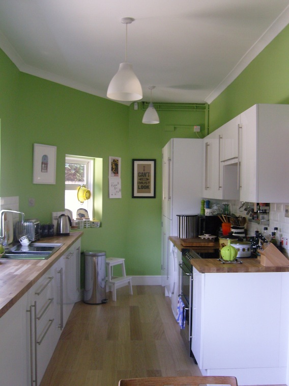
We created a kitchen that served us well but I started getting the bug to re-do it, mainly after seeing the rather fabulous job Kate had done on hers. [Thanks Abi! I posted some photos here a while back if you want to see it]. I wanted a bit more character, a little more storage and a lot more work surface; I wanted to create a room that nodded towards my mid-century tastes but didn't want it to end up looking like a retro home. So off I went with a (slightly) larger budget than nine years ago and barrel load of ideas. And now it looks like this...


The first thing was a major decision: to remove the wall that separated the kitchen and utility room – we decided to do this to free up space and create a galley kitchen; giving us more light and space so it would feel more like a kitchen/dining room. This was the worst bit of the project – clearing out the entire kitchen, everything covered in dust and rubble (my idea of hell, DUST), and masses of hammering; not good when you work at home. Still, our fab builder did it in a few days and then the real fun started...


The red quarry tile floor (above) went first; as lovely as the tiles are they just didn't fit with the mid-century mood I wanted and as it would have cost a fortune and taken days to remove them we found an engineered limed oak wood flooring  we laid right on top.

A new radiator went in; when I say new I mean old-new; these gorgeous reproduction cast iron radiators are gradually being fitted in all our rooms; they're not cheap but they pack out a lot more heat than conventional radiators and retain their heat a lot longer once your heating is off so they actually save money in the long run.

I always liked the high gloss white units we had so to save money we just hunted around and bought a few extra units and doors to add to the existing ones. I used DIY Homefit for the doors – they also make custom size doors at very reasonable prices. We also reused a left over door to add to the plinths. All the appliances went into integrated units to keep the sleek look of the kitchen; except the tumble-dryer – it's extraordinarily expensive to find an integrated one so we just tucked the new one under the worktop. I also caved, after many years of resistance, to a dishwasher. I am now a bit evangelical about it; they're lovely things. I love mine very much.

We upgraded the (now much longer) worktops to solid oak; you need to sand them down and then apply about six coats of wood oil to seal them. Remember to reapply the wood oil once a year to help keep the wood looking delightful. I loved the mix of woods taking shape; especially knowing the teak table and chairs just waiting to be moved in (more on them later).


We replaced the brown tiles on the walls with small white brick bevelled tiles, above; Tons of Tiles supply exactly the same tiles as other fancypants high street stores but at half the price. I love these little tiles; retro but super high gloss to go with the cupboards.

Already the kitchen was lighter, brighter and felt more spacious. We put the old storage cupboards back up on the back wall, just a little lower down so I could display all my 70s coffee pots on them (and reach them – my, considerably taller, husband had originally hung the cupboards to his height, effectively rendering them out of bounds for titch me).

Finally, the paint decision. Never have I deliberated more. I didn't want white or beige or anything neutral but equally I didn't want too heavy a colour to darken the kitchen again. In the end I went for an apple green; it's bright and crisp during the daylight but at night in artificial light it goes a zingy lime. I got the paint from Crown at B&Q after looking at many many expensive others – it's called Olive Press but don't be fooled, it's definitely apple green. Maybe it's a confused olive, either way I think it makes my kitchen look yummy.

And then, after three long weeks of dust, dirt, grime and washing up in the bath I got to do the thing I'd been waiting for: putting everything back and hanging pictures and scattering 60s and 70s pottery everywhere – heaven. I'd been buying up cheap bits and pieces from Ebay, scouring car boots (there's a particularly brilliant one, Fontwell Park Car Boot, near my mother-in-law's and charity shops and have found a few gems, like these...


My mum is also good at finding things – saucepans in particular (although the brown one, above, is from her, a nice reminder of days spent sitting on the kitchen worktops 'helping' her cook when I was a little girl).

We put up lots of pictures and prints and the giant M (above, husband's birthday present) will go on the wall when we've found an A to go with it (I got the pink ampersand from eBay). And don't be shy of places you might normally not visit – I found some Orla K style storage jars for a fiver each from Matalan, the candle sticks, pictured above, are from my new favourite place Tiger, as were the picture frames (a quid each!); the postcards are all from the big box of Penguin book covers; a steal at £9.99 for 100 book covers – the display possibilities are endless but I dug out the green ones to go in the kitchen, and added some Argos retro tin caddies.

The table was the best bargain – totally free from a trader at the aforementioned car boot; he was packing up for the day and just didn't want to take it back with him – we couldn't believe our luck – a teak 1969 Macintosh table; it's always worth hanging about the big traders at the end of the day I've discovered; they'd often rather give stuff away than cart it back with them. The danish teak chairs we had in storage and fit perfectly with my mid-century vision, although I think I'll recover the seats with a green fabric at a later date.

So, the kitchen's all done and on a fraction of what you could've spend if you'd got a big store to do it. It might take longer, the dust and grime and upheaval are nearly unbearable and I never want to see another microwave meal in my life but now I have my dream kitchen; full of personal touches that make me smile when I'm cooking and, if I'm completely honest, I think my cakes taste a teeny bit better too.