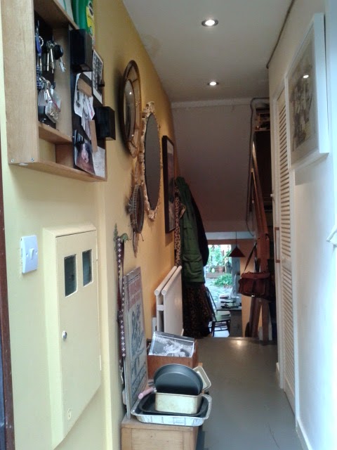
Sometimes the only way to solve problematic parts of your home is to live with them... and live with them... and make mistakes, then some more mistakes, until finally you have a lightbulb moment. I've had one, and my hallway has just got a dramatic makeover. But first, here's how the entrance hall looked when I moved in.
Dark, wasn't it? One of the first things I did was move the front door and replace it with a different design that I pinched from some friends, who'd pinched something from a skip (but that's another story). The new front door would, in theory, allow more light in.
It needed some colour, I figured. I'd already given the staircases a big flash of brightness, with multicoloured painted risers, and so I simply chose the sunniest of those shades and applied it to the dingiest of the two walls. It was definitely better. And a few mirrors captured what light there was and shared it about a bit.
It just never felt like a calm space to come home to though. Not only was it still flirting with dinge, but all the stuff on the walls in this narrow thoroughfare created a bit of claustrophobia.
My vast shoe collection didn't help, and generally wouldn't be contained beneath the little table that was meant to hide it, while the top of the table was a general dumping ground for tat we were too lazy to put somewhere else.
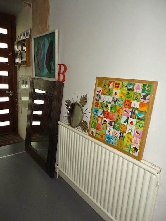
But then the lightbulb moment finally came. Initially, it was inspired by my neighbours' vast living room mirror. They had that when I moved in seven years ago but, like I said, ideas can take time to ferment. A visit to an Eritrean restaurant that had made cunning and discombobulating use of a similarly large glass clicked things into place, and so I saved some money and ordered the massive thing pictured below. It wasn't cheap, but I was banking on the effect being so dramatic that, along with a little shelf to be painted the same colour as the wall so it would effectively become part of the hallway's architecture, it would be worth it.
I was underwhelmed.
But slowly the rest of the idea came into focus: the yellow was the problem. The hallway was dark, but the mirror gave it space. So rather than try to create artificial brightness as well, perhaps it was time to embrace its moody side. So I bought some dark grey paint which, I figured, would have the added bonus of helping the wall merge into the floor, creating a more streamlined space to further reduce visual clutter.
Then I wavered: would it be too much? Was I sick of dark grey paint? The Farrow & Ball Downpipe revolution of 2011 has definitely peaked... But I put my interiors obsessive's viewpoint to one side and went for it.
There's only one remaining issue...
My boyfriend reckons we should paint this understairs nook dark grey too. It's flaky and needs repainting full-stop, but I was poised with a simple refresh, as I quite like it white. Hmm. He could have a point though. To be continued...


It looks great! There's a lovely blueness to the grey. Where did you get the wooden coat hooks? I'm looking for something similar.
ReplyDeleteThanks,
Miriam
Thanks Miriam! It's a Dulux colour called Bowler Hat. The wooden coat hooks are actually from Ikea... but I bought them a long time ago and don't think they still do them. I am quite taken with their newest range of adjustable, colourful wooden hooks though – quite different but they look exciting: http://www.ikea.com/gb/en/catalog/products/S89031668/
DeleteThanks Kate, and well done on the new job. Glad to hear you will still be blogging here. x
ReplyDelete