recent posts

social media menu

Showing posts with label hallways. Show all posts

Before & After: the dark grey hallway takeover continues

I've been banging on about my hall sporadically over the past couple of months. The entryway part of it got quite a major overhaul to boost light and declutter it. 

But leftover was this little understairs nook. Which I sort of liked as it was...


But since we'd painted a wall in the top part of the hall dark grey, there was an argument that the new wall needed a same-coloured buddy to balance things out (you can check out the other wall here, where I also asked your advice about whether or not to repaint the stairs nook dark grey too).

Apart from the untidy lighting wire I need to find a solution to, the area looked OK. But because there's no natural light, the white never really looked especially white...

Though it still was a vast improvement from what it had been previously...

...somewhat cluttered. It was my workspace for a while when I had lodgers, and I'm not sure now what those charts were stuck up on that shelf, but seeing them every time I came in and out of the neighbouring kitchen can't have been relaxing.

Even tidy it looked pretty busy.

But then this scary giant clear-out happened, and I moved my workspace upstairs and out of sight from day-to-day living.


But in the end, I was seduced by dark paint. And things went from this...

...to this...

...and this...


I'm kind of over dark grey, but – like its wall partner up the stairs – the understairs area had to blend with the floor to visually create more space rather than being chopped up with colour changes (and the floor isn't due for a change for a good while yet). And the other point was to make it dark so it was cosy rather than grubby looking. I think it's better. Do you?

Real homes: evolution of a
dingy hallway

It's only taken seven years, but I think I've finally cracked the dingy hallway, first mentioned here a few weeks ago

Sometimes the only way to solve problematic parts of your home is to live with them... and live with them... and make mistakes, then some more mistakes, until finally you have a lightbulb moment. I've had one, and my hallway has just got a dramatic makeover. But first, here's how the entrance hall looked when I moved in.

Dark, wasn't it? One of the first things I did was move the front door and replace it with a different design that I pinched from some friends, who'd pinched something from a skip (but that's another story). The new front door would, in theory, allow more light in. 


It worked to a point. But the space was still pretty dingy. Fresh white walls and new floors looked smarter but still the dark vibe remained.


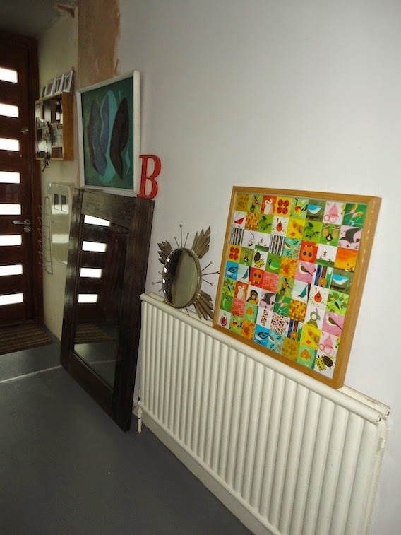
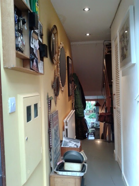
It needed some colour, I figured. I'd already given the staircases a big flash of brightness, with multicoloured painted risers, and so I simply chose the sunniest of those shades and applied it to the dingiest of the two walls. It was definitely better. And a few mirrors captured what light there was and shared it about a bit. 

It just never felt like a calm space to come home to though. Not only was it still flirting with dinge, but all the stuff on the walls in this narrow thoroughfare created a bit of claustrophobia.

My vast shoe collection didn't help, and generally wouldn't be contained beneath the little table that was meant to hide it, while the top of the table was a general dumping ground for tat we were too lazy to put somewhere else.

But then the lightbulb moment finally came. Initially, it was inspired by my neighbours' vast living room mirror. They had that when I moved in seven years ago but, like I said, ideas can take time to ferment. A visit to an Eritrean restaurant that had made cunning and discombobulating use of a similarly large glass clicked things into place, and so I saved some money and ordered the massive thing pictured below. It wasn't cheap, but I was banking on the effect being so dramatic that, along with a little shelf to be painted the same colour as the wall so it would effectively become part of the hallway's architecture, it would be worth it.

I was underwhelmed. 

But slowly the rest of the idea came into focus: the yellow was the problem. The hallway was dark, but the mirror gave it space. So rather than try to create artificial brightness as well, perhaps it was time to embrace its moody side. So I bought some dark grey paint which, I figured, would have the added bonus of helping the wall merge into the floor, creating a more streamlined space to further reduce visual clutter. 

Then I wavered: would it be too much? Was I sick of dark grey paint? The Farrow & Ball Downpipe revolution of 2011 has definitely peaked... But I put my interiors obsessive's viewpoint to one side and went for it.


I like it a lot; finally opening the front door provides a view I'm happy to see.

There's only one remaining issue...
My boyfriend reckons we should paint this understairs nook dark grey too. It's flaky and needs repainting full-stop, but I was poised with a simple refresh, as I quite like it white. Hmm. He could have a point though. To be continued...

Real homes: my gloomy hallway

The dingy hallway has never reached its potential.

First the shiny lime green highlights, bequeathed by the previous owners got whitewashed – but with such limited light in the area, it just looked grubby, particularly one side of the space – and so efforts have since been focused on that one wall.


The new front door, with glass panels was meant to help. But still the troublesome hall wall stayed resolutely gloomy. Perhaps it needed some colour?

So it got a half-wall flash of brightening yellow – a dado rail-less spilt-screen effect, kind of thing which, to my disappointment, looked absolutely awful. So the lovely sunny yellow filled the rest of the wall... For a joyful few weeks, it seemed like it had worked (though painting the radiator to blend in was an ugly mistake). But the allure of the yellow was short-lived – being simply better than white wasn't enough. But the colour did make me happy. So last week, after saving up (to the tune of £300-odd – eek!), this giant mirror was specially cut and fitted – an idea shamelessly stolen from my neighbours' living room. And, lo, suddenly there was light, or at least a sense of space.

Only now the yellow looked even wronger... (excuse the dust, the result of some ongoing woodwork). The shade was chosen to pick up on the yellow in the painted staircase, but all of a sudden, as most of it was covered by a big piece of mirror, it looked a bit random.

And so today, since I have a day off, I am abandoning the idea of paint as a brightener and embracing the hall'a natural gloom and the dark side. OK, well I'm embracing dark paint...

Grey, specifically. I figure if the wall and the floor co-ordinate, the sense of space thing will only be stronger. Will it work? Can I ditch my #interiorstwat colour faddiness and shake off thoughts about dark grey walls being so 2011? And what colour will the radiator be?

In a few hours I'll know. Wish me luck...

House porn Thursday: a space-saving NY loft with space for three generations

There's so much to love about this hallway, featured in NY Magazine's ever excellent Design Hunting section, edited by Wendy Goodman. 

The Manhattan apartment was redesigned by its owners specifically to accommodate visiting children and grandchildren. And it's done some very clever things to maximise the available space, as well as making it flexible, depending on who's staying.

Photo: Frank Oudeman for New York Magazine
Hence the nifty fold-down hallway beds. Ingenious. And the combination of the bare brick walls – love the fact the building's structure has given it a row of nooks, on the left – with sleek white fittings, that fantastic, colourful runner on the floor and, importantly, good lighting, makes it so much more than a corridor.

Here's a glimpse of some of the living area. Concrete and bare wood (especially in that incredible clock): top combination.

Photo: Frank Oudeman for New York Magazine
But you need to check out the soundproofed TV cube – check out the full story and slideshow at Design Hunting.


Get the look


Contemporary starburst wooden clock, £94, Jazzitupinteriors.co.uk
Wooden disc clock, £34, Jazzitupinteriors.co.uk (both clocks come in walnut or oak)

Recycled rag runner, £20, Not on the High Street
Rug, £40 (down from £70), Urban Outfitters

Faux sheepskin rug, £10, Ikea (for the sheep lovers among you – if you prefer the real thing, they also sell those for £30), Ikea.com; Olive green 60s/70s swivel arm chair, currently £60 (auction only), eBay.co.uk

There is also some info half way down this makeover post about how to get concrete surfaces without the weight and without quite so much expense.

Post by Kate