recent posts

social media menu

Showing posts with label pattern. Show all posts

Rug love

You may remember I had an issue with a rug earlier this summer. It was in my friend's flat in Berlin that I helped him do up. I've had some grief for posting about it but, hey, it's already done so in case you didn't see the Ikea monochrome rug saga, here's a little recap.

It got me tuned into rugs. They are expensive and often a bit hard to visualise in a space – making them quite stress-inducing to buy. So I was really impressed by the Plantation Rug Company's approach: don't just show us the rugs, show us some rooms. It really works, I am really inspired and now want to go out and buy rugs for every room in my house. They are very well priced, too...

Freddie (also comes in red, taupe, black and gold) 100% wool, from £100 for 120cm x 170cm
It is brilliant to see strong patterns and colours like the ones above and below in situ. Sometimes you really need furniture to be able to imagine it in your own context...

Leaf, 100% wool, from £150 for 120cm x 170cm

Shetland, 100% wool, from £150 for 70cm x 140cm
...or unexpected contrasts to spark a new idea for a room...

Lily, 100% wool, from £225 for 120cm x 170cm
I love the combination of this bright, granny crochet pattern with the clean white table and wooden sideboard. The dark floors really work to let its vibrant colours do their thing unimpeded, too.

Nomadic, 100% wool, from £225 for 120cm x 180cm (or £150 for the 120cm circular version)
...and I love how the skilled styling has made me look at rugs I might not otherwise consider as designs I could incorporate into my own rooms. I'd have walked straight past this one, I reckon. But it's actually quite good.

Ooh, and a gold star for anyone who spots the renowned designer whose house is used in one of these shots.

By the way, I have now got lots of before and after pictures of the Berlin flat to post up. They are coming soon.

Introducing... Pen & Gravy


At the weekend I walked through my local market, to-do list in pocket and not intending to stop – but then I got drawn into a little stall selling the most beautiful, colourful graphic patterned plates – and also striking hand-drawn fabric lampshades with the same repetitive designs. 

Turns out the seller, also the designer and maker, is Jamie – aka Pen & Gravy (pictured at his stall, below) – and, in his own words, he "draws on lampshades and plates", as well as selling screen-printed versions of his designs as wall art.

The patterns remind me a little of the West African wax prints I'm often found banging on about enthusiastically here, or those geometric colouring books you used to be able to get – anyone remember what those were called?* Many a rainy childhood Sunday was eased with one of those and some felt-tips.


Visit the Pen & Gravy blog to see more of Jamie's work, and you can buy some of it via his Etsy shop, though, as Jamie warned me on Saturday, there isn't much stock online. Best thing is if you like any of the things in the pictures on his blog, just email him and he'll either dig one out or knock you one up bespoke styles. Plates start at £20 and A3 prints start at £10. 


* A helpful reader knows exactly the ones - see comments section to find out if you're interested

Neisha Crosland's vinyl
floor tiles

Vinyl flooring has been getting better and more interesting in recent years – and is a brilliantly affordable way to get yourself a stylish floor. I have my whole ground floor done in dark grey vinyl, which I love (though it's not quite as good at hiding muddy dog paw prints as I'd hoped...). 

Now the textile designer, Neisha Crosland, has brought out a range which is on sale at John Lewis.

It looks just like old-school ceramic floor tiles, doesn't it? Except you won't break your cereal bowl if you drop it in an early morning daze on this flooring, which costs just £47.89 for 12 tiles (seen individually, below) at John Lewis.

"A painted floor in an old house inspired this Celtic Cross design" says Crosland. "I think it works very well as an alternative to a chequerboard pattern." The tiles come in Charcoal, Sage, Stone or Turquoise. They are available from next month at Harvey Maria. Understated and classy.

From my own experience, vinyl flooring is excellently practical but I wouldn't advise trying to fit it yourself. It shows the tiniest bumps on whatever's underneath it (including joins between MDF boards), so needs very careful preparation of the existing floor to look slick. It can also be more fragile than one would expect and can tear; but only if you drag, say, kitchen appliances across it. Until I had mine fitted, I didn't know you could also get colour-matched caulk, or silicone filler (which may mean nothing if you are not a DIY nerd like me) to give the edges the tidiest finish. A good idea.

Above, an example of Neisha Crosland's more traditional tile designs – these vibrant beauties are the Haveli collection.

Above, clockwise from left Find alternative vinyl flooring also worth checking out from: The Colour Flooring Company, who sell a range of gorgeous vibrant colours in sheet vinyl form, Zazous, which also supplies Victorian-reminiscent patterns and Cath Kidston, whose trademark florals as well as her cowboy print and different coloured dotty designs now come in floor tiles. 

Who lives in a shed like this...?

It's Chelsea Flower Show season: the 99-year-old event opens officially today, but I got a sneak preview* of one of the exhibits from yesterday's press day. And it's not hard to tell who is behind this retro palette and patterns... 

The instantly recognisable designer responsible is, of course, Orla Kiely. The pleasingly sludgy colours, punctuated by sharp bursts of brightness, and her trademark geometric-floral designs have become rather ubiquitous, but they look fresh in this new, outdoor setting... and more like a 70s timewarp than ever.

I don't know if I could live with it, despite the 1970s being an era I'm particularly drawn to aesthetically, but that wallpaper is fantastic. And it is Orla's bold, colourful mixing and matching that makes it – and stops it coming over all Terry and June.

What I like about her style is that she does pretty without going too girly-girly, thanks to the lack of whimsical pastels and the strength of  the geometry. I love, too, how she clashes pattern and colour, as above; a couple of years ago I interviewed Kiely, who shared some inspiring tips for putting different textiles together effectively and explained how the Ireland of her childhood in the 60s and 70s first inspired her designs.

The theme of this design is around relaxation and reading. I can certainly imagine drifting off in it, and dreaming I'd turned into Felicity Kendall in The Good Life.
Orla was one of five designers contributing to the Artisan Retreats area this year.

* Thanks to my spy, Paul, who was manning the garden sponsored by his firm, APCO, whose design theme is pastoral communication throughout history (in other words, people talking and making decisions in gardens down the years). 

The V&A's pattern archives


The V&A has an incredible three million designs for textiles, wallpapers and prints. Lots are 20th century designs and the museum has taken a selection and adorned new objects with these little bits of design history. 

The range includes things covered in designs by Keith Vaughan, a self-taught artist and conscientous objector to WW2, whose work forms an exhibition on until June 12 at the excellent Pallant House Gallery in Chichester; the colour Brit fashion designer/national treasure, Zandra Rhodes, John Drummond, who designed for Hull Traders and also Sandersons during the 1950s; textiles designer and fashion tutor at Central St Martins, Natalie Gibson, who is profiled colourfully on the Stylelikeu blog;  Eddie Squires, who commemorated the moon landing in 1969 with his Lunar Rocket design. These are my favourites from the shop...

Clockwise from top right:

Homemaker plate, £12
Designed by Enid Seeney in 1957ish and produced by Ridgeway Potteries this classic design has now been reissued.

Teal Leaf stag head (small), £35
Although they've been dotted through magazines and on Pinterest again and again, I still haven't tired of the stag head as a good bit of home decor. I prefer mine made rather than shot, and this wooden one is enhanced further with patterns taken from 18th and 19th century Italian textiles. Apparently it can be hung outdoors as well as inside. He'd make a great feature for a garden needing a splash of colour (particularly if, like me, you are so inept at gardening that you won't get that in your flowerbeds).

Fisherman (left) and Fishes tea-towels, £5 each
Printed with designs, respectively, by Keith Vaughan (see intro) from 1956; and Rhona Park, from a 1951 furnishing fabric, are part of a vast range of gorgeous textiles from the V&A in dishcloth form, for just a fiver. I have a friend who has turned tea-towels as wall-art, by putting them in frames and into home-made cushion covers (with different fabric as a backing).

V&A Pattern: Liberty & Co book, £7.99
Here are 80 pages of pure pattern from the Liberty Archives, plus a free high-res CD of images to play with. You can see more of this beautifully packaged series as well as some other lovely design books here.

While browsing the V&A shop, I also discovered a great search facility that allows you to search patterns by decade. Here, for example, is the 1950s section. I could flick through these for hours...

Guest post:
a kitchen fabric makeover from La Petite Congolaise

Apologies firstly for the extended absence. Blogger robbed me of hundreds of images and I have been slowly trying to re-upload them. You will still see the odd gap (and a big old ugly question mark in the place of a photo). I'm working on it. But thought it was time to come back while I do with a post I had poised before going off-air a fortnight ago. Here you go...


In my kitchen I have a storage bench up against one wall. The seat cushion part is covered in some beautiful blue African fabric, a lovely gift from a good friend. I have a back-up cover too, in a different, more multi-coloured African fabric. The bench is lacking in cushions though, to make it more comfortable and to add to the colour in that corner of the room. This I want to change but found myself stuck for ideas...


There is the obvious plain fabric option (but which colour/s?); but there's something chilly about that end of the room, so ideally I'd like to maximise warmth with a clash of sunshine-y patterns. But that's where I got extra stuck. Not my comfort zone. Whichever cushions I choose probably ought to tie  into the rest of the room too, which includes a pale, mustardy yellow and an Yves Klein blue, plus a dash of orange.

Bench cover  one
Bench cover two


So I asked the lovely Laurence Kanza, of La Petite Congolaise, an expert who I have featured before here, if she'd give my bench a virtual makeover with some of her beautiful cushions (ie, via the magic of Photoshop; and please excuse my dubious skills on that front). Here's just some of the lovely stuff Laurence sells:

Orange accents

'Instinctive'

Thank you Laurence – and over to you...


Colour is a quick and easy way to transform the mood of a home. The world of wax prints offers an added dimension with it’s myriad designs and colour combinations. If you are new to wax prints or a little overwhelmed by the variety, I offer you three quick tips: 
# 1 Relax – allow yourself to be taken in by the abundance of choice.
# 2 Trust your instincts – go for what you love, your heart will tell you if a print right your home or not. 
# 3 Take your time and enjoy yourself – colour is the perfect winter pick-me-up!

Bench cover one: blue bird print
This is an old print design is known as “Hirondelle” (swallow) in the Congo. Although this print can be found in a variety of bright colours, here the cool, pared down combination of blue and white makes it a perfect backdrop for colour.  

Makeover # one 'Repeat After Me'
Combination to try: Juno x 3  


How this combination works
  • Some prints naturally lend themselves to repetition, in this case, the circular theme becomes a fun visual indulgence
  • Restricting the palette to a few shades allows the designs to be seen at their best

Style tip Add plain navy blue cushions creates a “pause” among the circles


Makeover # two 'Bold Geometrics'
Combination to try: Juno + Gilles  


How this combination works
  • The uplifting combination of yellow and blue make for a quirky, yet harmonious contrast of old and new
  • Although not an immediately obvious pairing, Gilles injects an unexpected degree of individuality and character

Style tip A continuity of colour will enhance the warm and welcoming mood within the most social part of the home.


Bench cover two Kente print
This is a wax print interpretation of strip weaving (Kente), one of West Africa's oldest art forms. The beauty of Kente designs is the variety of patterns found in one cloth; however the key to working successfully with Kente designs, is balance – the Kente print is the star of the show at all times.

If you are interested to know how traditional strip weaving (Kente) is made, check out these clips on YouTube (one and two). The skill involved is awe inspiring. 

Makeover # one 'Understated Bench Fellows'
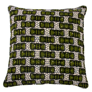
Combination to try: Marc + Jean


How this combination works
  • By staying within a predominantly green palette, the yellow and red of the print are emphasised without overwhelming the space
  • The geometric pattern in Marc subtly mirrors sections of the kente without competing for attention

Style tip Take your cue from your particular Kente colour scheme and work within its parameters – think complement rather than clash

Makeover # two 'A Mixed Affair'
Combination to try: Marc + Jean + Marie-Jeanne 


How this combination works
  • Adding Marie-Jeanne balances out the red of the Kente print
  • Juxtaposing geometrics brings visual interest, yet still allows the Kente to maintain centre stage

Style tip The extra pop of red creates a sense of warmth to the cold corner of the room


*******


Wow, thank you Laurence, that was so interesting and helpful. I've learnt lots about how to grapple with lots of pattern and got over my fear of being bold with these colourful textiles. (By the way, there are some more tips from Laurence here in case you're interested). 

Now all I have to do is make a decision... Which would you go for?