recent posts

social media menu

Showing posts with label painting. Show all posts

Etsy UK is having a – real-life – exhibition

I've found some pretty special art over the years on Etsy – these affordable portraits are particularly memorable, as is the work of this Israeli artist (I've since bought two of her mini canvases and love them very much). I've also admired some rather unusual portraits on the site, too.

And now Etsy UK is hosting its very own art exhibition – a real one, not a virtual one. And here's my favourite piece in it.

It's called Path to the Beach and is by Shetland-based painter Kristi Cumming who runs an Etsy shop called Islandla. It's also the painting used in the poster to advertise the show (good to know I'm on the same wavelength as those Etsy bods). And this inaugural event takes place in London (but they're hoping to roll it out nationwide before too long) and you can catch it in Clerkenwell over the weekend, from Friday 17 to Sunday 19 October.

More than 600 Etsy sellers applied to appear, from all over the country, but there was room for just 15 of them – from oil painters to ceramicists – at the show. You can check out the line-up and all the details at the Etsy exhibition page right now.


Introducing... Tali Yalonetzki, Israeli painter

I have fallen in love with this painting. It's called Nature Trail.

And I'm writing about in the hope that someone might buy it, so that I can stop looking at it and thinking: "Should I buy it?" I've been stalking it for weeks, trying to conjure up justifications to splurge.

It's not at all expensive – not for a beautiful and original painting: it costs around£96, and is acrylic on canvas. (I just haven't nailed that justification yet, with Christmas coming up and all. But I'm still working on it.)

The painting is by Israeli magazine illustrator and artist, Tali Yalonetzki who lives in Tel Aviv. Her work is for sale on Etsy at her shop Tush Tush (details below). I love her family paintings too.

Check out Grandparents in Their Yard, above, on sale for £51ish (this one is around 28cm x 28cm, the top painting is a little larger). Such expressive faces.

Both of these are paintings you could just gaze at for hours, creating stories and seeing more each time – as the best art should always make you do. Here are a couple more favourites.

Alida, around £54
Grandma & Grandpa, around £48.

She also produces what she calls Tiny Canvases, 10-12cm x 10cm or thereabouts, and priced at around £13 (I love the one pictured below, called Early 80s). Great gifts. Worldwide shipping, at around £2, is very reasonable too.

Find Tush Tush on Etsy.

Post by Kate

Trevor Burgess exhibition

Tonight I'm going to the private view of an exhibition of paintings by Trevor Burgess. I've posted about Trevor's work here before, which I absolutely love. Especially the series that makes up this show, which takes place in London from today.

'A Place to Live' is a show made up of Trevor's depictions of urban housing; none of it is made to look beautiful and stylish, it just is what it is and – just like London – none of it matches, in style, period or value. He has painted the homes, found in estate agent adverts, onto plywood. I love his democratic approach, the attention he has lavished on the very ordinary: on the ordinary places in which most of us live. Home is home.


'A Place to Live' is on at the Dreamspace Gallery in London's Clerkenwell. It runs from today until 12 December. Find out more on the gallery's website. And if you can't make it down to see the paintings in person, you can get a good look at them all on Trevor's website, under the 'gallery' tab. Just click on 'A Place to Live'.

Some beautiful paintings

Buying prints of paintings can be an affordable way to get some original art onto your walls. And I came across these prints of Clare Elsaessa's lovely paintings in her Etsy shop, Tastes Orangey. Coincidentally – or not – I have previously featured the California-based painter's other half, Kai Samuels-Davis and their home, which was the subject of an Etsy tour earlier this year, but was unaware of the link when I saw Clare's work. 

Check it out here, and also Kai's work, which I also really love. Isn't it funny how these two painters and partners have such companionable styles? I wonder if their styles grew together, or found each other fully-formed?


Covered, £28.77, 13" x 19"

Succulent£9.59, 8" x 10"

Portrait in Yellow£28.77, 13"x19"

To Sea, £9.59, 8"x10"
Black Lab, £28.77, 13"x19"

The prints come with borders; personally I would frame them without the borders, adding a mount board instead of you want that effect – otherwise it just screams 'print' rather than 'painting' from 100 paces...

Postage (from the US) is just under £9

Mini Moderns' new eco paint (in project-sized tins)

I've got some painting to do round my place, so paint is on my mind. There is a paint that I'm really excited to try, which I shall post about shortly, that may be the answer to my two-year procrastination about repainting a vast set of box-shelves in my bedroom. Stay tuned. Meanwhile...

...also exciting was the news, yesterday, that Mini Moderns – thus far, purveyors chiefly of beautiful prints on wallpaper and things – are launching their own 12-colour range of environmentally-responsible paints. Here is a little preview (the range has yet to go on sale):


'Environmentally responsible' could mean almost anything. In this case, I really like the concept behind it: the company is working with an award-winning brand called Newlife Paints, which salvages discarded paint from landfill and incineration; revives and treats it and repackages it, good as new. I intend to find out more about quite how they take a zillion different colours and turn them into clean, fresh, white emulsion – as the online explanation is frustratingly brief if, like me, you need to know the 'how'.

The Mini Moderns paints have been created to match their wallpapers (very mid-century, as you can see), and cleverly comes in a small-but-double-the-amount-of-a-sampler-pot size (250ml), for just £5, so you can buy just the right amount to perk up a chest of drawers or a chair. The regular size tins, 2.5 litres, will be £32.

Painting the stairs

When I decided to paint my stairs, I knew it would be an arduous job. I didn't think that what I started before Christmas would only just have come to an end though... Wow. So, 35 steps and 8 (final) colours later, I thought I should share the fruits of my labour intensive endeavour.

Here is the middle flight of stairs, undercoated...


And here is the same flight, all done. The idea behind the colours was that they would tie in the main colours in the rest of the house, to create a bit of unity. I also wanted them to have a hint of late 1950s, as I love that palette and lots in my house nods towards that era. This meant they should be fairly muted – also I didn't want a great big, bright statement when there are so many stairs and so many colours generally in the house. You can see below some false starts on the colour choosing journey.

And the stairs on the ground floor, before and after. My stair bunnies (which move around all over the hallway) are £8 each from Urban Outfitters

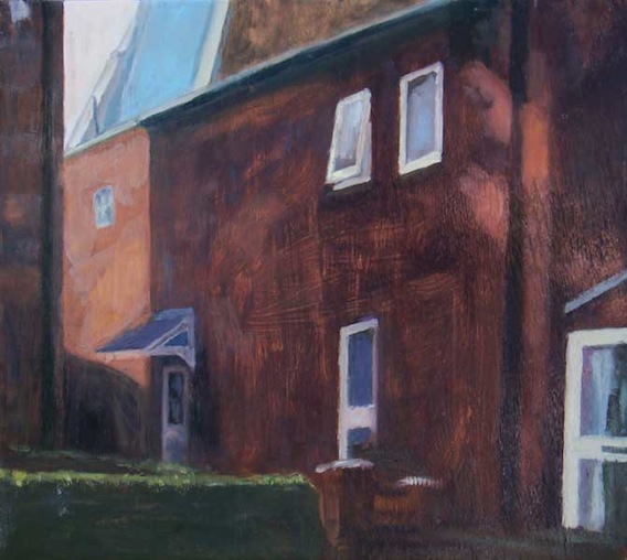
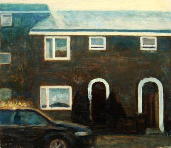
Here are the stairs at the top of the house, before and after. It gets the most light as there is a skylight above them. Amazing how different the same colours look in different positions, isn't it? 

Predictably, I started having doubts about whether I liked the effect as soon as I'd finished. But I'm going to have to learn to love it – no way am I repeating the operation again in a hurry! That said, I'd love to get your opinions or similar experiences; even if you don't like it. 

The floors downstairs are all grey linoleum, so I thought I'd do the treads of the stairs in the same colour for unity (and handily, Ronseal's grey floor paint, above right, happened to match exactly). Don't do as I did though, and shake the tin so feebly that you just get a weird transparent black gloop. Which, like a dunce, I started painting with not realising what was wrong for one whole flight. That was annoying. It's quite weird paint, but when it's dry the finish is excellent – a soft sheen but not shiny or slippery.

Here (above) are some of the dominant colours elsewhere in the house that I was trying to channel in the stairs. Lots of blues and greens and a bit of pale, midcentury yellow. The strong blue wall, above left, covers one end of my kitchen. The other end is visible in the next picture. You can see the grey floor clearly here, too. It stretches into the main hallway to the front door, which is the floor above (so the floor at the bottom of the stairs with the rabbits on them, above). 

Choosing the colours was a much more involved process than I'd imagined. There were some false starts, trying out colours that didn't quite work – see above. Top left, I felt these were just too strong and would overpower the house. If I lived in a minimalist white box, it could maybe work but as you might be able to tell from the photos around the house above, I'm a bit of a collector. Could have been overwhelming... or looked like a children's nursery. The ones on the right were very nearly right, but the middle green was a bit acid, and the yellow the same. They also didn't quite flow together pleasingly in that order. Which is where the separate bits of paper, below, came in handy. 

My friend Holly's mum, Lesley, kindly offered to drive both of us to the paint shop as we both happened to be getting the brushes out that weekend, with no wheels except bicycle ones between us. Handily, Lesley is also a very talented artist and has a great eye for colour, as well as some extra tester pots. Over several mugs of caffeine at her house, and lots of experimentation on pieces of paper, we got the colours just right (the middle choice, above, bar the first yellow, which I substituted last minute with a Farrow and Ball colour, as Holly gave me a small pot of it and it was just right and very close to what we'd chosen). 

In case you'd like to know what these are, I've listed them below with links. Click through and you'll see how massively different colours look on screen to in situ. It really does pay to always test before committing... much as that pains my impatient nature.

Farrow & Ball: Citron (Dulux Earth Glaze 6 is a very good match)
Crown: Gold Leaf (Period range). I found this the worst quality of the paints; the others needed two coats, this needed three. Bespoke, below, also didn't have great coverage.
Crown: Bespoke
Dulux: Teal Tension

I bought matt emulsion in each colour to speed the process up and keep it cheaper (I used two tester pots of each colour only for the whole lot – apart from the Crown colours). You can't get quick dry, water soluble gloss mixed in tester sizes, as it only comes in standard colours unless you buy larger quantities (I think). But on that topic, if you aren't already familiar with quick dry gloss, get involved! It is excellent if you have a lot of white woodwork to paint in gloss, dries in a couple of hours and the brushes are easy to clean. Here I used the same brush so had to wash it between shades – would've been a total mare with oil based paint.