Please do bear with the recent break in my usually regular posts. Things will be back to normal within a few weeks – but meanwhile, a quick find I'd like to share.
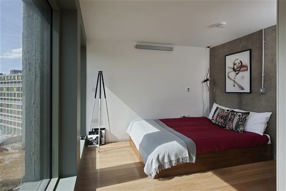
I've seen this print – or, at least, very similar – in numerous interiors shoots, and I have coveted it HARD.
Tonight, while researching for the Independent Christmas Gift Guide that I'm in the middle of compiling, I stumbled across it on Clippings.com. Hurrah!
I was surprised to discover the photograph was of Brighton Beach, rather than somewhere glossier and hotter. Though when you look closer, it all makes sense. The image is by photographer James French, who has "done a John Hinde" on his final print, giving the colours a technicolour buzz just as the old English postcard master once did.
The limited edition prints start at £75 and are available at Clippings.com
Showing posts with label photography. Show all posts
Object of the day: Slim Aarons photography made affordable
I have previously lusted here over Slim Aarons' gloriously glamorous seventies photography.
But have never been able to afford it... until now.
Just when I thought digital wall print experts, Surface View, couldn't get any more exciting (you may have seen my breathless post about their John Hinde range a few months back), they pull another corker out of the bag: yes, now you can get your mitts on one of these babies for as little as £60.
So, for £60 you can get a poster version of one of the prints, while wall murals are priced at £60 per square metre. Canvas prints and birch ply prints start at £145 and £175 respectively. Check out the full range at Surfaceview.co.uk
But have never been able to afford it... until now.
Just when I thought digital wall print experts, Surface View, couldn't get any more exciting (you may have seen my breathless post about their John Hinde range a few months back), they pull another corker out of the bag: yes, now you can get your mitts on one of these babies for as little as £60.
So, for £60 you can get a poster version of one of the prints, while wall murals are priced at £60 per square metre. Canvas prints and birch ply prints start at £145 and £175 respectively. Check out the full range at Surfaceview.co.uk
Labels:
#cheaphometricks
,
1970s
,
photography
,
prints etc
,
seventies
,
slim aarons
,
surface view
,
walls
Surface View collaborates with the John Hinde Collection
I've written about Surface View and their brilliant wall murals before.
Highlights, for me at least, have included gems by Hemingway Design and George Stubbs' Whistlejacket, from SV's National Gallery collection. I didn't think it could get any better – and then I heard about the new John Hinde collection...
Any of the options are a bit of an outlay, but when something is so very special, it's worth blowing the budget.
Highlights, for me at least, have included gems by Hemingway Design and George Stubbs' Whistlejacket, from SV's National Gallery collection. I didn't think it could get any better – and then I heard about the new John Hinde collection...
Regular readers may know of my Hinde infatuation. And if not, and the name means nothing to you, a quick synopsis: John Hinde photography was the British company behind the UK's most iconic postcard images of the 1960s and 70s.
Gloriously retouched, because real life just wasn't colourful enough, and – as I found out when I tracked down one of the company's original photographers to interview for a piece in the Independent Magazine – also routinely staged, the postcards are now nostalgic reminders of holidays from a bygone era.
The postcards also captured tourist spots all over the world and some of these examples, as well as some of the British ones, have been turned into these giant wall murals by Surface View in collaboration with the John Hinde Collection. The John Hinde Collection is not, in fact, anything to do with the original postcard company; it is a small organisation founded in recent years by two Hinde superfans who acquired much of its photographic archive and have since set about lovingly preserving, restoring and painstakingly re-colour-touching hundreds of the original photographs used to create the postcards.
Above are (from top) the Icod de los Vinos Wall Mural, the Florida Waterway and Beach at Dunn's Falls. Along with the other images available in the range, these cost from: £60 per square metre in wall mural format; £145 for a canvas print; £175 for birch ply prints; £60 for a poster; £125 for a textile wall hanging; £85 for window film; £85 for lampshades. You can even get the image printed onto ceramic tiles, though at £515 that might test even the most hardcore Hinde lover's purse.
Any of the options are a bit of an outlay, but when something is so very special, it's worth blowing the budget.
Find out more and buy at Surfaceview.co.uk
Post by Kate
Exhibition: Clip Cut Gel, or masculinity explored through 80s barbershop photos
If you've ever gazed at those faded barbershop model shots, of men you can't imagine ever meeting, sporting hairstyles that never age beyond the 80s, then you'll love this new exhibition by artist, Julia Riddiough.
The angle of Clip Cut Gel is modern masculinity: male grooming, gender politics and the gaze and what it means to be a man today.
The photographs above, titled (from left to right), Playboy, Toyboy and Rough Trade, are part of the exhibition, which takes place online, at the website of innovative east London gallery, A Brooks Art, which Riddiough also owns.
The show will also pop up in local high street barber shops and at regional UK art festivals along with live performances by a barber shop quartet. And you can watch an intriguing accompanying film, focusing on the three throwbacks above...
The models featured were picked by Riddiough from male hairdressing magazines she's collected since the 1980s. As she explains: "The portraits reveal amplified masculine characteristics; drawn from male stereotypes that we see in the visual language that surrounds us everyday...[and] Clip Cut Gel plays with the way the male is looked at and builds it into a spectacle itself. Here the image of the man is seen as passive and raw material for the active gaze of the spectator."
The photographs are also for sale, in limited editions of 50.
I've written about A Brooks Art gallery before (so-titled as it was the name of the long-standing florist who had previously owned the site) when it was exhibiting a wonderful selection of photographs of abandoned cinemas.
To find out more about the artist and the gallery, check out Julia Riddiough's website and A Brooks Art. See more about the exhibition, including live dates, at the Clip Cut Gel page.
Images © Julia Riddiough
The angle of Clip Cut Gel is modern masculinity: male grooming, gender politics and the gaze and what it means to be a man today.
The photographs above, titled (from left to right), Playboy, Toyboy and Rough Trade, are part of the exhibition, which takes place online, at the website of innovative east London gallery, A Brooks Art, which Riddiough also owns.
The show will also pop up in local high street barber shops and at regional UK art festivals along with live performances by a barber shop quartet. And you can watch an intriguing accompanying film, focusing on the three throwbacks above...
The models featured were picked by Riddiough from male hairdressing magazines she's collected since the 1980s. As she explains: "The portraits reveal amplified masculine characteristics; drawn from male stereotypes that we see in the visual language that surrounds us everyday...[and] Clip Cut Gel plays with the way the male is looked at and builds it into a spectacle itself. Here the image of the man is seen as passive and raw material for the active gaze of the spectator."
The photographs are also for sale, in limited editions of 50.
I've written about A Brooks Art gallery before (so-titled as it was the name of the long-standing florist who had previously owned the site) when it was exhibiting a wonderful selection of photographs of abandoned cinemas.
To find out more about the artist and the gallery, check out Julia Riddiough's website and A Brooks Art. See more about the exhibition, including live dates, at the Clip Cut Gel page.
Images © Julia Riddiough
Labels:
A Brooks Art
,
artwork
,
exhibitions
,
Julia Riddiough
,
photography
,
prints etc
,
walls
Spotlight on... photography
for walls
I love a framed beach photograph.
And this one, taken on a packed Bondi looks great in a clean white frame on a white wall, don't you think?
The photograph is by Louisa Seton and part of a limited edition of 500 for sale in this A1 size at the reasonable price of £50, from a new company called Lumitrix.
It reminds me a little of this, which I featured in a previous post.
Good, commercially available photographic prints – unless bought directly from the photographer or at a gallery exhibition – is so often mass produced, dull and tackily reproduced. So it's great to see new outlets doing different.
I'm not sold on all of the stuff so far on sale on the site, but this dramatic equine image taken by Astrid Harrisson also (and unsurprisingly) caught my eye.
It was taken on a farm in Iceland and also £50 and sold as part of a limited edition too.
There's definitely an art to displaying photography on your walls. Here are a couple of other ideas I like.
Not so keenon the subjects in these photos, but love the large format colour images displayed in white frames. I'm inspired to expand my John Hinde display – taking photographs from a book is another way to afford to adorn your walls in this way.
Images: Street Style Fashion; A Estate Studio
And this one, taken on a packed Bondi looks great in a clean white frame on a white wall, don't you think?
The photograph is by Louisa Seton and part of a limited edition of 500 for sale in this A1 size at the reasonable price of £50, from a new company called Lumitrix.
Good, commercially available photographic prints – unless bought directly from the photographer or at a gallery exhibition – is so often mass produced, dull and tackily reproduced. So it's great to see new outlets doing different.
I'm not sold on all of the stuff so far on sale on the site, but this dramatic equine image taken by Astrid Harrisson also (and unsurprisingly) caught my eye.
It was taken on a farm in Iceland and also £50 and sold as part of a limited edition too.
There's definitely an art to displaying photography on your walls. Here are a couple of other ideas I like.
Not so keenon the subjects in these photos, but love the large format colour images displayed in white frames. I'm inspired to expand my John Hinde display – taking photographs from a book is another way to afford to adorn your walls in this way.
Images: Street Style Fashion; A Estate Studio
Exhibition & Book: "I've Lived in East London for 86 ½ Years"
London-based photographer Martin Usborne met Joseph Markovitch, 86 ½, on an unusually hot day in Hoxton.
He asked to take his photograph (in "the hope of winning some award") but that one meeting turned into a project that has resulted in a series of beautiful portraits of Markovitch. These are part of a new exhibition and also feature in a very special coffee table book.
Markovitch, who sadly passed away last year, was a life-long Londoner and eccentric who said he'd only once left the city, for a trip to the seaside with his mother. And he saw east London change dramatically (I like his tragic story about the local mayor "also a chimney sweep" falling off a ladder to his death as he put up decorations for the Queen's coronation in 1953).
The images juxtapose Markovitch and his memories with the startlingly modern, technicolour east London in which he remained his whole life. The results are beautiful, poignant and witty.
The exhibition also features 50 People of East London, wry illustrations from Adam Dant. On until 30 March at cafe/bar/gallery The Proud Archivist, 2-10 Hertford Road, London N1 5ET. Tel: 020 7749 6852.
All images by Martin Usborne from his book, I've Lived in East London for 86 ½ Years, published by Hoxton Mini Press.
He asked to take his photograph (in "the hope of winning some award") but that one meeting turned into a project that has resulted in a series of beautiful portraits of Markovitch. These are part of a new exhibition and also feature in a very special coffee table book.
Markovitch, who sadly passed away last year, was a life-long Londoner and eccentric who said he'd only once left the city, for a trip to the seaside with his mother. And he saw east London change dramatically (I like his tragic story about the local mayor "also a chimney sweep" falling off a ladder to his death as he put up decorations for the Queen's coronation in 1953).
The images juxtapose Markovitch and his memories with the startlingly modern, technicolour east London in which he remained his whole life. The results are beautiful, poignant and witty.
All images by Martin Usborne from his book, I've Lived in East London for 86 ½ Years, published by Hoxton Mini Press.
The Friday edit: the week's best bookmarks
I'm dabbling with making this a regular Friday regular: a round-up of some of my favourite stories from around the web, the homes and design-y things I've bookmarked in the last week or so.
Let's give it a go.
Clockwise from top left
1. Donna Wilson has designed the interior for the remote Fogo Island Inn, off the coast of Newfoundland. There's a lovely story behind it and the building is incredible. Check it out at Donna's blog, Leaves and Twigs.
2. Close-up images of skyscrapers blur the lines between graphic design and photography. See more of Alexandre Jacques's architectural photographs at PSFK.
3. This print (designed by Marcus Eriksson) appealed because, just like Anna Dorfman, book cover designer and author of the excellent (and also newly discovered) blog, Door Sixteen, I'm going to Sweden too – for the wedding of some friends of my boyfriend in June. Never met them. Never been to Sweden. Love this poster because it made me even more excited about it. And made me laugh.
4. A very 70s Californian beach house – featured on Apartment Therapy, it is the real deal, pile carpets and pine kitchen cupboards and all. Loved it.
5. Peruvian textiles meet mid-century Danish design at A Rum Fellow with their new chair collection. Prices aren't small (£325-£950) so if you, too, can't stretch to the chair check out their colourful Peruvian tape (£7 in the sale) and trim one you already own. Read more about them here.
6. Painted wooden spoons! So simple, yet so pleasing. These ones are from Canadian Etsy shop Storiebrooke.
Good weekend all. What you up to in this grim weather? I'm looking forward to seeing Bill Callahan...
...and other than that, staying at home out of the rain eating cosy food, seeing the lovely Jill and Terence who live in this amazing house, watching Shane Meadows' Stone Roses film with them on the sofa and employing the dog as a hot water bottle.
Post by Kate. Images: Fogo Island Inn; Alexandre Jacques; Marcus Eriksson; Apartment Therapy; A Rum Fellow; Jessica Helwick
Let's give it a go.
Clockwise from top left
1. Donna Wilson has designed the interior for the remote Fogo Island Inn, off the coast of Newfoundland. There's a lovely story behind it and the building is incredible. Check it out at Donna's blog, Leaves and Twigs.
2. Close-up images of skyscrapers blur the lines between graphic design and photography. See more of Alexandre Jacques's architectural photographs at PSFK.
3. This print (designed by Marcus Eriksson) appealed because, just like Anna Dorfman, book cover designer and author of the excellent (and also newly discovered) blog, Door Sixteen, I'm going to Sweden too – for the wedding of some friends of my boyfriend in June. Never met them. Never been to Sweden. Love this poster because it made me even more excited about it. And made me laugh.
4. A very 70s Californian beach house – featured on Apartment Therapy, it is the real deal, pile carpets and pine kitchen cupboards and all. Loved it.
5. Peruvian textiles meet mid-century Danish design at A Rum Fellow with their new chair collection. Prices aren't small (£325-£950) so if you, too, can't stretch to the chair check out their colourful Peruvian tape (£7 in the sale) and trim one you already own. Read more about them here.
6. Painted wooden spoons! So simple, yet so pleasing. These ones are from Canadian Etsy shop Storiebrooke.
Good weekend all. What you up to in this grim weather? I'm looking forward to seeing Bill Callahan...
...and other than that, staying at home out of the rain eating cosy food, seeing the lovely Jill and Terence who live in this amazing house, watching Shane Meadows' Stone Roses film with them on the sofa and employing the dog as a hot water bottle.
Post by Kate. Images: Fogo Island Inn; Alexandre Jacques; Marcus Eriksson; Apartment Therapy; A Rum Fellow; Jessica Helwick
Labels:
a rum fellow
,
alexandre jacques
,
donna wilson
,
door sixteen
,
etsy
,
furniture
,
kitchens
,
photography
,
real homes
,
storiebrooke
,
the friday edit
On the last* day of Christmas... Matthias Heiderich's photography
Aren't these vivid photographs of Berlin architecture fantastic? They are the work German photographer, Matthias Heiderich.
They remind me a little of Slim Aarons' 70s beach photography – the colours, at least, as Aarons' work is full of people. But Heiderich's work is a bit more financially accessible – and one of his pictures would make an amazing gift, don't you think?
Heiderich has also turned his lens on the gleaming, crazy-looking towers of Dubai too which, like the Berlin ones, pare down a city's skyline to just one striking detail (see them lower down this post). These are now available to buy through a great new online store from just £25.
Fifty50Art is how I discovered Heiderich's work in the first place, and it is selling a set of the self-taught 31-year-old's work. Not mass-produced or flimsily printed copies, either. For £25, you get a numbered 20cm x 25cm print from a strictly limited edition run, which comes on high quality thick matt stock (Hahnemuhle's German Etching, for the paper nerds out there).
Fifty50Art Co-founder, Ben Golik, sent me this beautiful photograph – left – from Heiderich's Dubai set, by way of introduction. Below you can see how the print looks now, framed in black and on a shelf in the kitchen.
Heiderich, who was born in Hamburg but recently moved to Berlin, cites artistic influences as including electronic musician, Tim Hecker and fellow German architectural photographers Christoph Morlinghaus and Joseph Schultz.
"Berlin is the city where I started to photograph and all the Berlin sets reflect my evolution as a photographer," said Heiderich by email earlier today. "Berlin is my favourite city and for the past few years I have been out almost everyday trying to collect as many souvenirs as possible – and also trying to find my own photographic language and my own interpretation of the city and my surroundings."
Now he is casting his lens farther from home. Here are the other Dubai images in the set.
Fifty50 is one of a growing number of places specialising in affordable art, but without going down the depressing mass-production route to make it viable. I recently wrote about Fenton Art, which has an unusual and creative way of marketing the artists it showcases, while Outline Editions, which I love, has had big success by promoting the work of magazine and graphic illustrators as artworks.
Each champions its artists rather than selling them out – and Fifty50 are working to a similar model: the limited editions (just 50 of each print in any size are ever produced) mean artists aren't over-exposed and, thus, devalued. Fifty per cent of the profit also goes direct to the artist. There is also a constantly evolving roster to discover too, with new names and fresh artworks launching on the site each week and more sizes available priced between £10 and £200.
"Not everyone wants to live with 'open editions' from department stores or home stores," says Ben Golick, Fifty50Art co-founder, along with Clare Clarke. "And we think there's a gap in the market for truly affordable art that still feels special."
Matthias Heiderich's Dubai set comes in three sizes – the other two are priced at £50 (30cm x 40cm) and £75 (40cm x 50cm). Nose around Fifty50Art.com, where you can also browse works by Super Future Kid, Rose Sanderson and Harriet Russell. For more of Matthias Heiderich's work: Matthias-heiderich.de
You might also like some of these previous posts under the photography tab – whether it's of brutalist buildings, deserted houses, or is printed onto plates or wallpaper, or available to buy, frame and hang on a wall.
Post by Kate
*This is the last of my affordable Christmas gift idea posts (as I don't post at weekends, the 12 Days of Christmas theme has helpfully run entirely out of sync with the actual date). But I will be back later this week with a festive finale, featuring a spectacularly decorated home to inspire you instead. If you are still on the hunt for presents, do cast an eye over this lot you might have missed. I might feature a couple of bonus gifts this week too, so watch out. Now I'd better get on with my own Christmas shopping...
They remind me a little of Slim Aarons' 70s beach photography – the colours, at least, as Aarons' work is full of people. But Heiderich's work is a bit more financially accessible – and one of his pictures would make an amazing gift, don't you think?
![]() |
| © Matthias Heiderich, 2013 |
![]() |
| © Matthias Heiderich, 2013 |
![]() |
| © Matthias Heiderich, 2013 |
Fifty50Art is how I discovered Heiderich's work in the first place, and it is selling a set of the self-taught 31-year-old's work. Not mass-produced or flimsily printed copies, either. For £25, you get a numbered 20cm x 25cm print from a strictly limited edition run, which comes on high quality thick matt stock (Hahnemuhle's German Etching, for the paper nerds out there).
Fifty50Art Co-founder, Ben Golik, sent me this beautiful photograph – left – from Heiderich's Dubai set, by way of introduction. Below you can see how the print looks now, framed in black and on a shelf in the kitchen.
| Photo: Kate Burt |
"Berlin is the city where I started to photograph and all the Berlin sets reflect my evolution as a photographer," said Heiderich by email earlier today. "Berlin is my favourite city and for the past few years I have been out almost everyday trying to collect as many souvenirs as possible – and also trying to find my own photographic language and my own interpretation of the city and my surroundings."
Now he is casting his lens farther from home. Here are the other Dubai images in the set.
![]() |
| Matthias Heiderich via Fifty50Art.com |
![]() |
| Matthias Heiderich via Fifty50Art.com |
"Not everyone wants to live with 'open editions' from department stores or home stores," says Ben Golick, Fifty50Art co-founder, along with Clare Clarke. "And we think there's a gap in the market for truly affordable art that still feels special."
![]() |
| Matthias Heiderich via Fifty50Art.com |
You might also like some of these previous posts under the photography tab – whether it's of brutalist buildings, deserted houses, or is printed onto plates or wallpaper, or available to buy, frame and hang on a wall.
Post by Kate
*This is the last of my affordable Christmas gift idea posts (as I don't post at weekends, the 12 Days of Christmas theme has helpfully run entirely out of sync with the actual date). But I will be back later this week with a festive finale, featuring a spectacularly decorated home to inspire you instead. If you are still on the hunt for presents, do cast an eye over this lot you might have missed. I might feature a couple of bonus gifts this week too, so watch out. Now I'd better get on with my own Christmas shopping...
Labels:
architecture
,
Christmas
,
christmas gifts 2013
,
fifty50art
,
gifts
,
matthias heiderich
,
photography
,
prints etc
,
walls
Introducing... Richard Burniston's haunting photos of Wonder Valley
I came across Richard Burniston's beautiful images of derelict homesteads in the Mojave Desert through the Best Shots exhibition, which is on until next month. Aren't the colours incredible?
And couldn't you just stare at one of these pictures for hours, imagining the people so pointedly missing from it? (And ideally in a frame, on your wall – which is possible: details below.)
The images depict an area of around 400 square miles in California's Mojave Desert where hundreds of homes have been abandoned. Richard Burniston's images of the place are fascinating for the way they conjure up stories of abandoned lives: who lived there, where did they go, what can you guess about them from what they left behind?
The environment – temperatures can range from -18C to 54C across parts of the Mojave – is obviously one reason for the mass departures among homesteaders. Others have woken up surrounded by water, only to discover they'd built their homes across a seasonal watercourse. But, says Burniston, there has also been a spate of abandonments since 2009, suggesting the economic downturn has played a big part.
Finally – what are the logistics? How does he get around and discover these places? "The homesteads are dotted around about 400 square miles of open desert, criss-crossed by hundreds of dirt roads," he explains. "Most are very rough, so I rent a big four-wheel drive truck to get around and live out of it to save money.
"Desert camping is great. I locate the homes I photograph by driving all day down as many of the dirt roads as I can, and keeping meticulous notes of where and when I found them, plus details of what I found, the weather and so on. It's more fun than just a GPS reference – my note-books bring the experience to life for me. My favourite entry is “Chased by dog again. Close shave.”
Does Burniston have a favourite homestead, or a favourite found thing he's discovered during the project? "Each homestead is so unique," he says. "I’m passionate about all of them. At a push I would say it’s the house where I found the blue room with the armchair [top image]. It feels very peaceful in there, nice light. Out of shot, to the right, is a huge old white enamel stove, it’s always there whenever I drop in, like an old friend."
For all other print sales, and to see more of Richard's work, go to Richardburnistonphotography.com
Post by Kate
And couldn't you just stare at one of these pictures for hours, imagining the people so pointedly missing from it? (And ideally in a frame, on your wall – which is possible: details below.)
![]() |
| All photos: Richardburnistonphotography.com |
"It really is called Wonder Valley!" says Burniston when I ask him about the unlikely name for his documentary series. "There are signs at both ends of the Valley saying 'Welcome To Wonder Valley'," he continues. "It seemed a natural title."
Hove-based Burniston became a photographer full-time this year, after leaving a career in film marketing for the big US film studios. In his former life, he often found himself in California for work: "I love the peace, wide-open spaces and weathered colour palette of the Mojave Desert landscape," he says, and he stumbled across the abandoned homesteads – of which there are around 400 – while camping and hiking in the nearby Joshua Tree National Park.
His photographer's eye couldn't resist this "vast and varied collection of abandoned homes and everyday possessions, a kind of urban debris field of found objects scattered across the land".
Burniston explains why there are so many of these ghost houses: "Homesteading was kick-started there by something called the Small Tract Act in 1938, it was a way to get 'marginal' land settled – you could build a kit home in three days. Vacation or weekend homes were very popular at first, followed later by 'homesteaders', people who felt the lifestyle offered something they wanted, like privacy, low costs, plenty of nature."
The environment – temperatures can range from -18C to 54C across parts of the Mojave – is obviously one reason for the mass departures among homesteaders. Others have woken up surrounded by water, only to discover they'd built their homes across a seasonal watercourse. But, says Burniston, there has also been a spate of abandonments since 2009, suggesting the economic downturn has played a big part.
"I like to think I’m helping form a connection and an understanding of the people who took a shot at living there," says Burniston. "The homes are like enigmatic lines drawn under a period in people’s lives. I am also fascinated by the transformation of this built environment as it’s slowly reclaimed back to nature, with a little help from vandals, and how it shows in the weathering of the homes’ exteriors and the personal items scattered about."
Has he ever met any former residents? "That’s next," he says, "but with a twist. I first want to get closure on this part of the project, documenting the abandoned homes, and then create a companion piece that records the lives of people who still live in the Valley amongst the relics of the departed. Imagine living on a street with 99 abandoned houses, and you live in the 100th. What must that feel like? That’s what I want to discover next."
"Desert camping is great. I locate the homes I photograph by driving all day down as many of the dirt roads as I can, and keeping meticulous notes of where and when I found them, plus details of what I found, the weather and so on. It's more fun than just a GPS reference – my note-books bring the experience to life for me. My favourite entry is “Chased by dog again. Close shave.”
If you would like to buy one of Richard Burniston's Wonder Valley prints (and this is just a small selection) you can contact him via his website. Prices will depend on the size and paper and "turnaround for orders is quick" says Burniston. The image that's part of the exhibition is for sale at £175 via Bestshots.co.uk. Catch the last leg of the touring exhibition, which features 100 winning images from different photographers, at Michelham Priory, Hailsham, East Sussex. It runs until 11 December, 2013. Sussexpast.co.uk
Labels:
Best Shots
,
exhibitions
,
gifts
,
photography
,
richard burniston
,
walls
Emma Boomkamp's wallpaper with history
What do you make of this? It's a bit full-on, but I kind of like it – but then I find anonymous old portraits are endlessly absorbing. However, I'm almost more interested in the story behind the wallpaper.
It's almost the perfect design for a downstairs loo or the loos at a restaurant, don't you think? A bit too much to have in your face in the distance, perhaps, but brilliant close-up with your full attention. And here's a close-up of the design, above, Femmes Fatales.
Staring at all those different characters really fires the imagination. Who were they? Were they happy? Heroic? Notorious? What daily worries troubled them? And as for those spectacular outfits...
The paper, which comes in three themes – broadly: men, women and children – comes from Dutch/Mexican designer Emma Boomkamp, (very) full name Emma Gavaldon van Leeuwen Boomkamp, and the back-story is lovely. The range, called Vanitas, is made up with photos from the archives of Atelier Jakob Merkelbach, a renowned Amsterdam photography studio that opened in 1913.
Here are the two other designs, Mauvais Garçon and Enfant Terrible, in close-up form.
What chaps! (What props!)
Recently, this extensive photographic collection was digitised – no mean feat since the images were on glass plates, many coloured by hand on both sides of the glass. There were also 40,000 of them.
Part of the purpose of this painstaking task, commissioned by Amsterdam City Archives, was to showcase the images in order to find out who the people in the photographs were. It was also to preserve them, since in the 1970s thousands of the pictures were destroyed by a flood – they didn't want to lose any more. You can read more about the project over at the website of the devoted digitisers, Picturae.
And in the designer's own words: "Vanitas presents an enchanting look into the past and reminds us of the transience of life."
For the next three days, you can buy Emma Boomkamp's wallpaper at Triitme.com, a short-sale site specialising in European design. It costs around £169 for nine metres – making a tiny space like a loo more appealing still. You can also check it out at Emmaboomkamp.com
Post by Kate
The paper, which comes in three themes – broadly: men, women and children – comes from Dutch/Mexican designer Emma Boomkamp, (very) full name Emma Gavaldon van Leeuwen Boomkamp, and the back-story is lovely. The range, called Vanitas, is made up with photos from the archives of Atelier Jakob Merkelbach, a renowned Amsterdam photography studio that opened in 1913.
Here are the two other designs, Mauvais Garçon and Enfant Terrible, in close-up form.
What chaps! (What props!)
Recently, this extensive photographic collection was digitised – no mean feat since the images were on glass plates, many coloured by hand on both sides of the glass. There were also 40,000 of them.
Part of the purpose of this painstaking task, commissioned by Amsterdam City Archives, was to showcase the images in order to find out who the people in the photographs were. It was also to preserve them, since in the 1970s thousands of the pictures were destroyed by a flood – they didn't want to lose any more. You can read more about the project over at the website of the devoted digitisers, Picturae.
And in the designer's own words: "Vanitas presents an enchanting look into the past and reminds us of the transience of life."
For the next three days, you can buy Emma Boomkamp's wallpaper at Triitme.com, a short-sale site specialising in European design. It costs around £169 for nine metres – making a tiny space like a loo more appealing still. You can also check it out at Emmaboomkamp.com
Post by Kate
Hurrah for Park Hill Estate
Why? The sprawling 1960s-built estate in Sheffield is one of six British buildings shortlisted for the RIBA Stirling Prize (the winner is announced in September).
The Grade II Listed estate – the largest listed structure in Europe – which sits high on one of Sheffield's surrounding hills, was nearly demolished in the late 1990s but got saved when English Heritage gave it its listed status.
Concrete in construction, the vast, brutalist building was designed by Ivor Smith and Jack Lynn and became famous for its "streets in the sky", as well its light and spacious two-storey double-aspect flats. Which helped to get it listed. So rather than being pulled down, it was redeveloped by private developers, Urban Splash, in partnership with Hawkins-Brown and Studio Egret architects. The development is still only in its first phase – and this is what's up for the award.
Park Hill, above, before the redevelopment. The revamp has seen the windows widened, colourful metal panels clad onto the exterior and a swish sales office installed (though residents will remain a mix of social and private).
There are, of course, pluses and minuses around this sort of modernisation – gentrification and its effect on the local community being key. But however that pans out – and the promised mix of social and private tenants, along with a rows of shops within the estate boundaries, bodes well, in theory at least – but it is still, surely, greener and more meaningful to restore rather than demolish and start from scratch. And, for midcentury urban architecture geeks, the best bit is that Park Hill remains a glorious concrete monster, looming over Sheffield.
Contrary to what many might understand by "brutalism", the term (I discovered on a brilliant architectural tour of the Barbican Centre recently) actually means "raw concrete", from the French, rather than "brutal-looking". But it is pretty brutal-looking – and beautiful for it. And if you like this sort of thing, you might also like these amazing photos of Preston Bus Garage, as well as artist Claire Scully's beautiful work, left, which throws nature and urban architecture together.
Rachel Cooke's piece in the Observer, a couple of years ago, about the redevelopment of Park Hill is also a good read.
The Grade II Listed estate – the largest listed structure in Europe – which sits high on one of Sheffield's surrounding hills, was nearly demolished in the late 1990s but got saved when English Heritage gave it its listed status.
![]() |
| Images: Urban Splash |
Park Hill, above, before the redevelopment. The revamp has seen the windows widened, colourful metal panels clad onto the exterior and a swish sales office installed (though residents will remain a mix of social and private).
There are, of course, pluses and minuses around this sort of modernisation – gentrification and its effect on the local community being key. But however that pans out – and the promised mix of social and private tenants, along with a rows of shops within the estate boundaries, bodes well, in theory at least – but it is still, surely, greener and more meaningful to restore rather than demolish and start from scratch. And, for midcentury urban architecture geeks, the best bit is that Park Hill remains a glorious concrete monster, looming over Sheffield.
Contrary to what many might understand by "brutalism", the term (I discovered on a brilliant architectural tour of the Barbican Centre recently) actually means "raw concrete", from the French, rather than "brutal-looking". But it is pretty brutal-looking – and beautiful for it. And if you like this sort of thing, you might also like these amazing photos of Preston Bus Garage, as well as artist Claire Scully's beautiful work, left, which throws nature and urban architecture together.
Rachel Cooke's piece in the Observer, a couple of years ago, about the redevelopment of Park Hill is also a good read.
Subscribe to:
Posts
(
Atom
)