recent posts

social media menu

More makeover action

At the weekend, I posted about the little revamp I'd done of my office. I only showed one side of the room, so wanted to give the other an airing too, which got a bit of a dye job...

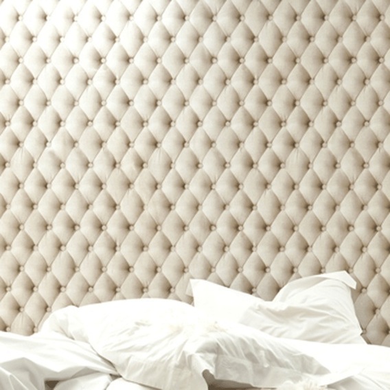
The room is pretty small, but there's just about space for a single bed. I liked the idea of  a day bed in; that way it could still be a spare bed for guests, but also somewhere for me to, well, I don't know. I imagine reclining glamorously on it while dreaming up dazzlingly creative ideas. In fact, I'm mainly chained to the computer while my own Little Lord Fauntleroy benefits, as you can see in the pictures. But I digress.

My aim was to stop what is in fact a single bed from looking totally like one. Or at least to smarten it up a bit. I had some drab noughties bedspreads, cheap cream things from Habitat, and as they were a good texture and size, the aim was to transform them with some dye, rather than forking out for a new cover. As if by telepathy, Dylon's PR called me while I was walking the dog and pondering all this; I told her about the bed project, and she offered to send me a few samples for free to try out. So I did.

Above right you can see my new "Kenneth" print; a brilliant graphic of Kenneth Williams, grinning above one of his catchphrases "Stop Messing About". The aim is that as I can see it from my desk, it will prevent excessive procrastination (I should probably put it in the kitchen instead). Kenneth comes from the wonderful Ministry of Words and costs £35. They've just started selling a Frankie Howerd one, with "Titter Ye Not" on it in case you're interested.

So the dyeing was pretty simple. Only, being impatient, I managed to cock up by not pre-washing the bedspread (the instructions expressly warned against this; and above right, you'll see why...). Fortunately it is a double bedspread and the bed it's on is single, so the patchy bits are well hidden. You can buy the dye on Amazon for under a fiver, and the Dylon website has lots of advice and list of all the colours they do. 
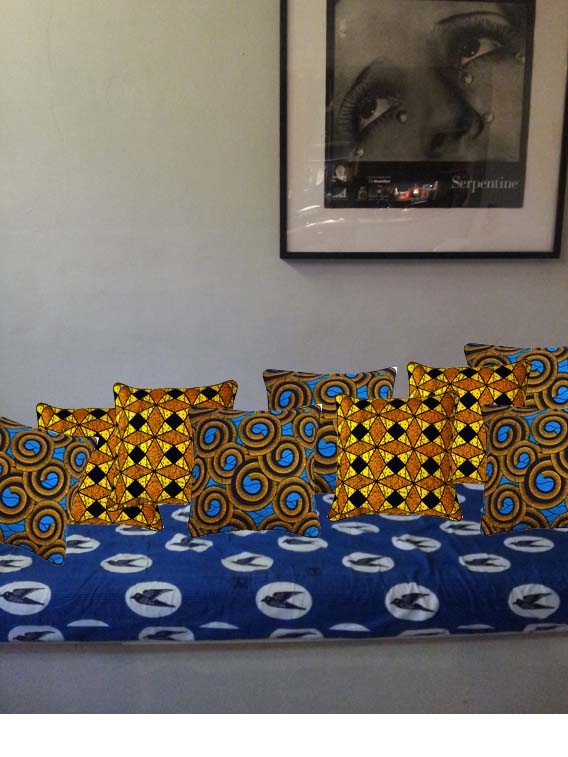
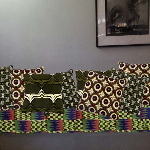
The range isn't huge, but apparently you can – if you're bold enough – mix them yourself. I tried the "Jeans Blue" one, but the shade (on my cream bedspread, at least) was rather insipid. I was a bit reckless as I had two of bedspreads, so could afford to experiment. The grey one, and the cushion cover I dyed to match it, worked out much better. Patchy bits aside.

I haven't yet tried the green but the whole project has made me think about what other unloved textiles might work with a new colour. Meanwhile, I'll have to get some black to re-dye the blue one I'm not so fond of. But all of that is a whole other project...

Meanwhile,  here are the final bits and pieces I transformed...

The filing cabinet has been around for years. It was once all grey. I inadvisedly painted the drawers, badly, this weird pink colour years ago. The result was so ugly that the drawers had been languishing in "for the tip" pile for years. But now they look rather sprightly again, I think.

The shelves, which – with the filing cabinet – in fact form the base of my desk (that piece of chip board propped against the wall, middle row on the left – you can see the full desk here) were found in the street. I toyed with spraying both bits of furniture, but it was mid-winter and the prospect of getting them into the garden, and getting myself out there were just not appealing. So lots of sanding and lots of drying time for the gloss paint – et voila. They worked out OK I think.

Finally, the chair. This I inherited from the last office I was in. Very comfortable, but deeply shabby. I had a scrap of this fabric going spare and, handily, the plastic edging to the chair is such that the fabric simply tucks into it. The quickest bit of re-upholstery ever.

Do you have a makeover project you'd like to share? Email it over to kate@yourhomeislovely.com if you'd like me to post it up on the site. Every little DIY is inspiring... especially when it's easy DIY...

Do you like cake?

360 Degrees of Cake: what a genius idea for a print. I'd like one of these in my kitchen. 

The artist, Linus Kraemer, was previously an engineer, which perhaps explains his unique take on, ahem, cake...

This A3 injet print, unframed, costs £12 and you can buy it from CultureLabel, or direct from the artist at his website. Where you can also find this lovely print, 'Peaks', £18, on the left.

CultureLabel promotes the arts, by making sure the price you pay through them or their partner outlets is the same that you would pay the artist or designer direct.


Habitat's Spring/Summer highlights


Looking at Habitat's bright and cheerful new Spring/Summer range has perked me up no end. 

I don't know why I love this Marnie ceramic house, £15,  so much. It is entirely useless, but very pretty. The shade of blue ("airforce blue", Habitat have called it), is particularly pleasing.

Clockwise from left: Dephina outdoor rug, £15 (120cm x 180cm); Couleur mug £2.50 (also comes in blue); Fruiti jug, £30; Evelyn cushion, £12


Before & after: do make me over

What are you dying to change about your home? For me, most recently, it was to create a creative space in which to work. I'm lucky to have the space for a home office, but for months I had no time to sort it out or decorate, and was working amid distracting chaos and aesthetically disconcerting decor. 

I hated it: it makes a huge difference if the place you spend most of each day makes you feel good and inspires you. So one of several big missions on a recent decorating spree was to give the room a bit of a makeover. Here are a couple of "before" shots. Scroll down to see how it turned out...

The chaos was doing my head in...


And now, the improved office...

I LOVE my revamped office. I painted the walls black to highlight the bright colours of my little wall collage; the desk is just a piece of chipboard that had been used for mixing plaster on ages ago. I turned it over and sanded and varnished it – it fitted perfectly on top of the shelves (just visible bottom right) that I found in the street and the filing cabinet that I painted (more of that in another post, soon). I love having plates on the wall, too – why confine them to the kitchen?

You can see the filing cabinet a little better here; I painted the drawers and the inside of the shelves on the left, the ones holding up my "desk" the same shade of sunshine-y yellow. On the far right, the plain white Ikea shelves are full of all sorts, so I thought they'd look better draped with muslin to hide the mess and keep that corner airy. The framed map of Manhattan is in fact a sheet of wrapping paper.


********* 

COMPETITION Where do you look for motivation to change stuff at home? If you think a trip to the Ideal Home Show might help get things moving, read on, as I have free tickets on the go... 

The event is 16 March - 1 April at London's Earls Court; it's been running since 1908 – love this image from it, left, in the 1960s. In fact I would quite like that kitchen... I remember going with my family as a kid (in the 1980s, not in 1908); my parents still have – and use – the orange plastic kitchen mandolin/multi-grater gadget thing I coerced them into buying after a man doing a demonstration said it would change our lives. Admittedly, it is a good gadget. But.

This year the event is sponsored by Everest Home Improvements, who have also kindly sponsored this post. Aside from what you'd expect (yes, Laurence Llewlyn Bowen) there's a how-to DIY stage, a "future home" gadgets area (more home cinema than plastic grater) and you can attempt to stroke Greg "Masterchef" Wallace's bald head during an IHS stalwart: the cooking demonstration. 

So to win the tickets (I've enough for five readers) just email me, saying what you would change about your home if you could. Maybe you'd finally pimp that spare room, like I did, or get Abigail Ahern to furnish your sitting room, perhaps swap all your chairs for design classics, or maybe buy one of those robot thingamys that do the cleaning for you... 

The five best answers get the tickets. Simple as that. Closing date is one week from today – midnight on Sunday 4 March. Emails to: kate@yourhomeislovely.com


Colouful recycled art

Seeing as it's so sunny outside (if you're in the southeast of England, at least), I thought I'd share some sunshine-y new artwork today. Each piece is not only gloriously colourful and aesthetically uplifting, but also made entirely from found rubbish on the street, in recycling bins or on the beach...

I've featured the unusual work of artist, Ella Robinson, here before. She lives near the seaside and began making work like this by collecting brightly hued bits of plastic washed up on her local beach.

Now she's doing more of the same but also – as above – collecting bottle tops from other people's recycling. Accordingly, this one is called 'Ice and a Slice'.

'David'

'Blue'

'Lucky'

See more of Ella's work on her blog and on her website.

Affordable oil portraits

I've been hankering after a great portrait or few for my home ever since I saw the incredible Seventies Scandi-style Nottingham home of Tim Rundle, below, in Emily Chalmers' Modern Vintage book... 


And now I've just found a purse-gentle way to get my portrait fix...


The Separation


Kai Samuels-Davis is a fine artist based in North California who sells – ta-da – high quality prints of his stunning oil paintings through his Etsy shop, Windy Lane Studio. Each signed print measures 11" x 16" (or 13" x 19" including the border, which personally I'd hide), and comes on museum quality, archival, 100% cotton rag fine art paper, and is reproduced digitally with high quality archival inks. The price? Just £32.50 (or $50), plus £8.08 ($12.50) for UK postage.

Aren't his paintings (above and below) beautiful? And while it's not the same as having the original canvas, it's a pretty top notch second best. Or you can splash out and invest in an original from Kai's studio; prices range from around £130 up to roughly £1,800.

Together Alone
Disappearing Boy
          
Kai also sells a selection of his paintings in sets of 5, 10 or 20 postcards, from around £3.50 to £10.99 plus postage.

I discovered Kai's work through the Etsy blog post about the beautiful home he shares with his wife Clare.

You can see more pictures of it here.

Trompe L'oeil interiors

I'm not sure if I love or hate this new Dutch Design Stool from Utility. What do you think?


The "Beechwood" stool, £25, from Utility, is not what it seems: it is made, not from wood at all, but from FSC corrugated cardboard, trompe l'oeil style. So the self-assembly stool is super eco-friendly (it  comes flat-packed) and is surprisingly sturdy – your largest friend (unless they are in the crane-lift out of bed arena) could comfortably sit on it, as it supports up to 200 kilos of person.

Do you love or hate its cardboard deception?


There's a lot of it about. It started with Piet Hien Eek's "Scrapwood" wallpaper, and now the idea has mushroomed...


This  Kapyton Linen Beige wallpaper paper looks so tactile and sumptuous. Couture Deco, $89 (£56) per roll, plus $9.99 (£6.30) UK delivery.

And while  this Boua Drift wallpaper doesn't have the variety of pattern that the Piet Hien Eek designs have, the price tag is much more accessible. It'd go well with the deliciously dusky, leathery scent of True Grace's Library scented candle or diffuser.

The fabric printed Montmartre stairs, $199 (£125) is the trompe l'oeil to trump them all.

Guest post:
a kitchen fabric makeover from La Petite Congolaise

Apologies firstly for the extended absence. Blogger robbed me of hundreds of images and I have been slowly trying to re-upload them. You will still see the odd gap (and a big old ugly question mark in the place of a photo). I'm working on it. But thought it was time to come back while I do with a post I had poised before going off-air a fortnight ago. Here you go...


In my kitchen I have a storage bench up against one wall. The seat cushion part is covered in some beautiful blue African fabric, a lovely gift from a good friend. I have a back-up cover too, in a different, more multi-coloured African fabric. The bench is lacking in cushions though, to make it more comfortable and to add to the colour in that corner of the room. This I want to change but found myself stuck for ideas...


There is the obvious plain fabric option (but which colour/s?); but there's something chilly about that end of the room, so ideally I'd like to maximise warmth with a clash of sunshine-y patterns. But that's where I got extra stuck. Not my comfort zone. Whichever cushions I choose probably ought to tie  into the rest of the room too, which includes a pale, mustardy yellow and an Yves Klein blue, plus a dash of orange.

Bench cover  one
Bench cover two


So I asked the lovely Laurence Kanza, of La Petite Congolaise, an expert who I have featured before here, if she'd give my bench a virtual makeover with some of her beautiful cushions (ie, via the magic of Photoshop; and please excuse my dubious skills on that front). Here's just some of the lovely stuff Laurence sells:

Orange accents

'Instinctive'

Thank you Laurence – and over to you...


Colour is a quick and easy way to transform the mood of a home. The world of wax prints offers an added dimension with it’s myriad designs and colour combinations. If you are new to wax prints or a little overwhelmed by the variety, I offer you three quick tips: 
# 1 Relax – allow yourself to be taken in by the abundance of choice.
# 2 Trust your instincts – go for what you love, your heart will tell you if a print right your home or not. 
# 3 Take your time and enjoy yourself – colour is the perfect winter pick-me-up!

Bench cover one: blue bird print
This is an old print design is known as “Hirondelle” (swallow) in the Congo. Although this print can be found in a variety of bright colours, here the cool, pared down combination of blue and white makes it a perfect backdrop for colour.  

Makeover # one 'Repeat After Me'
Combination to try: Juno x 3  


How this combination works
  • Some prints naturally lend themselves to repetition, in this case, the circular theme becomes a fun visual indulgence
  • Restricting the palette to a few shades allows the designs to be seen at their best

Style tip Add plain navy blue cushions creates a “pause” among the circles


Makeover # two 'Bold Geometrics'
Combination to try: Juno + Gilles  


How this combination works
  • The uplifting combination of yellow and blue make for a quirky, yet harmonious contrast of old and new
  • Although not an immediately obvious pairing, Gilles injects an unexpected degree of individuality and character

Style tip A continuity of colour will enhance the warm and welcoming mood within the most social part of the home.


Bench cover two Kente print
This is a wax print interpretation of strip weaving (Kente), one of West Africa's oldest art forms. The beauty of Kente designs is the variety of patterns found in one cloth; however the key to working successfully with Kente designs, is balance – the Kente print is the star of the show at all times.

If you are interested to know how traditional strip weaving (Kente) is made, check out these clips on YouTube (one and two). The skill involved is awe inspiring. 

Makeover # one 'Understated Bench Fellows'
Combination to try: Marc + Jean


How this combination works
  • By staying within a predominantly green palette, the yellow and red of the print are emphasised without overwhelming the space
  • The geometric pattern in Marc subtly mirrors sections of the kente without competing for attention

Style tip Take your cue from your particular Kente colour scheme and work within its parameters – think complement rather than clash

Makeover # two 'A Mixed Affair'
Combination to try: Marc + Jean + Marie-Jeanne 


How this combination works
  • Adding Marie-Jeanne balances out the red of the Kente print
  • Juxtaposing geometrics brings visual interest, yet still allows the Kente to maintain centre stage

Style tip The extra pop of red creates a sense of warmth to the cold corner of the room


*******


Wow, thank you Laurence, that was so interesting and helpful. I've learnt lots about how to grapple with lots of pattern and got over my fear of being bold with these colourful textiles. (By the way, there are some more tips from Laurence here in case you're interested). 

Now all I have to do is make a decision... Which would you go for?
  

Family (and other) treasured photos: a clever idea for display

I went round to my lovely friends Nick and Lulu's for dinner last week. They have a stunning house, and it always takes me about 20 minutes to focus on either of them as I gaze around at beautiful and stylish things they've moved or added since the last visit. And this, below, was what most transfixed me this time...


Very sweetly, it was Nick's anniversary present to Lulu; a grid formation collage of photographs of the family, their friends, their wedding... I think it's a really striking way to display favourite photos (rather than having them languish on your hard drive, or just pick three or four to blow up and print).

Nick spent a long time resizing all the images identically (the overall image is A0 size, 1189 x 841mm, so pretty big) and arranging them, using the design software, Quark. If you don't have digital versions of all the images, you'd need a scanner to get them on screen. Places like Snappy Snaps offer scanning services if you don't have access to a machine yourself. As for the printing, Bonus Prints go up to A1 size, which costs just under £30. For the layout, you could also use Photoshop, InDesign or possibly your computer's basic, in-house photography package. Nick got the whole thing printed on high quality paper, to give it a crisp, sharp finish.

I'd love to hear – and see – any similar projects other people have done. I've gathered up a big wicker basket of photos I love and am thinking of having a go at something similar myself.